
CLIENT:
JG Real Estate (Spec)
SERVICE
Art Direction Brand Imagery (world building visuals)
Website Graphics
Social media Ad Creatives
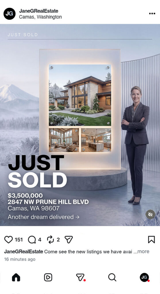
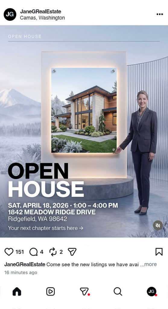
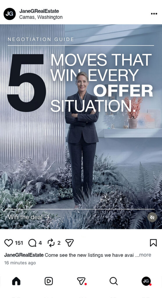
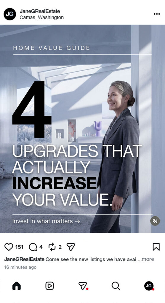
JG Real Estate is a Pacific Northwest real estate brand built around a specific personality — an agent whose love of hiking, architecture, and the natural landscape shapes how she sees and sells property. The client wanted a visual identity that felt nothing like typical real estate marketing. Rather than listing photos and sterile headshots, the ask was for a brand world that reflected her — precise, nature-connected, and visually considered.
Fletcher Rose Studio developed a full suite of campaign assets rooted in the PNW landscape: snow-dusted evergreens, modernist architecture, and cool winter light. Deliverables included brand imagery, agent portrait photography, hero images for the website landing page, and a social media content creation package.
Brand Imagery
Great brands don’t explain themselves — they show themselves. Brand imagery is the art of building a visual world so distinct, so considered, and so true to the brand’s core idea that audiences understand exactly who you are the moment they encounter you.


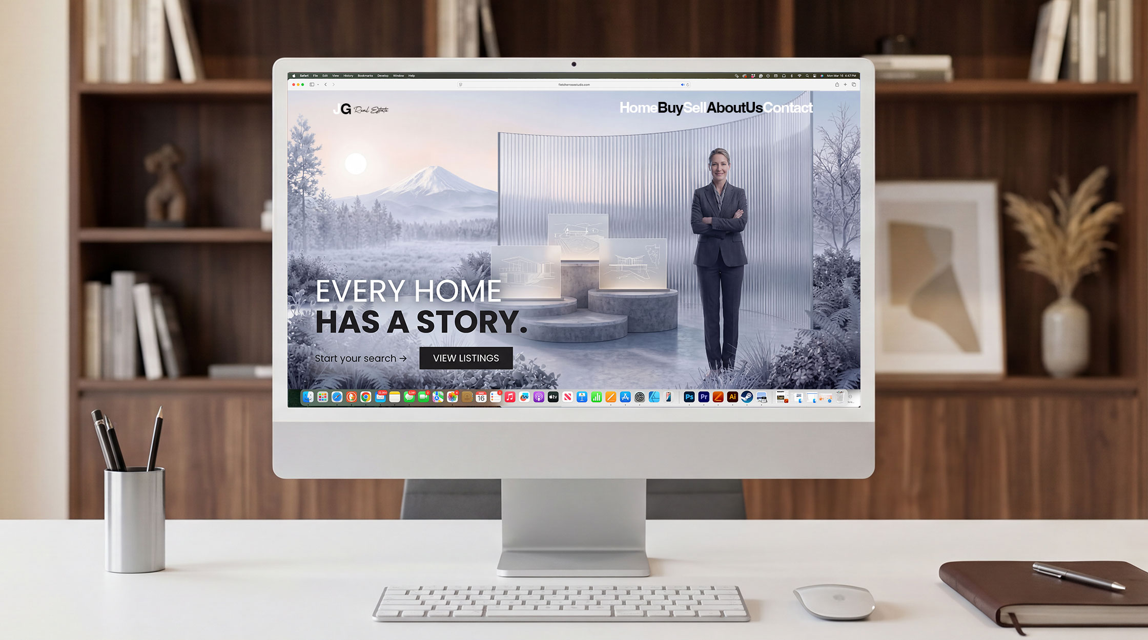
website hero landing page header
The hero header is where brands are won or lost. It is the first frame, the strongest visual argument, and the image a visitor carries with them long after they’ve left the page. With Fletcher Rose Studio’s AI-powered art direction, brands no longer have to choose between creative ambition and budget reality. Concept-driven world-building visuals — crafted with the precision of a Fortune 500 campaign — give a website’s hero section the kind of stopping power that transforms casual browsers into convinced buyers.


content creation Visual package
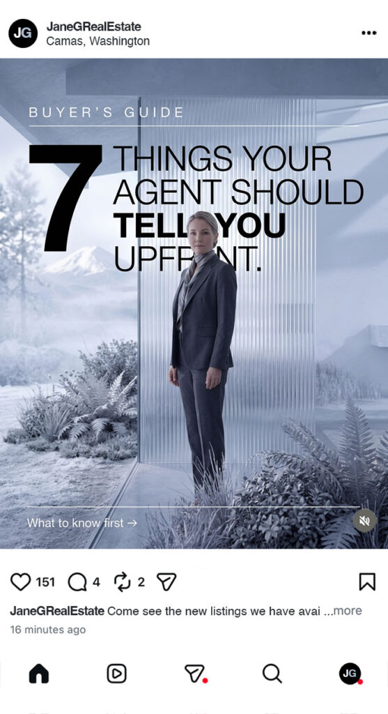
In a market where every agent is posting the same listing photos and the same smiling headshots, standing out isn’t about posting more — it’s about posting better. Fletcher Rose Studio’s AI-powered art direction and concept-driven artwork fundamentally changes what’s possible for a real estate brand on social media, delivering Fortune 500-level visual storytelling at a fraction of traditional production costs.


Project Case Study
The Creative Vision:
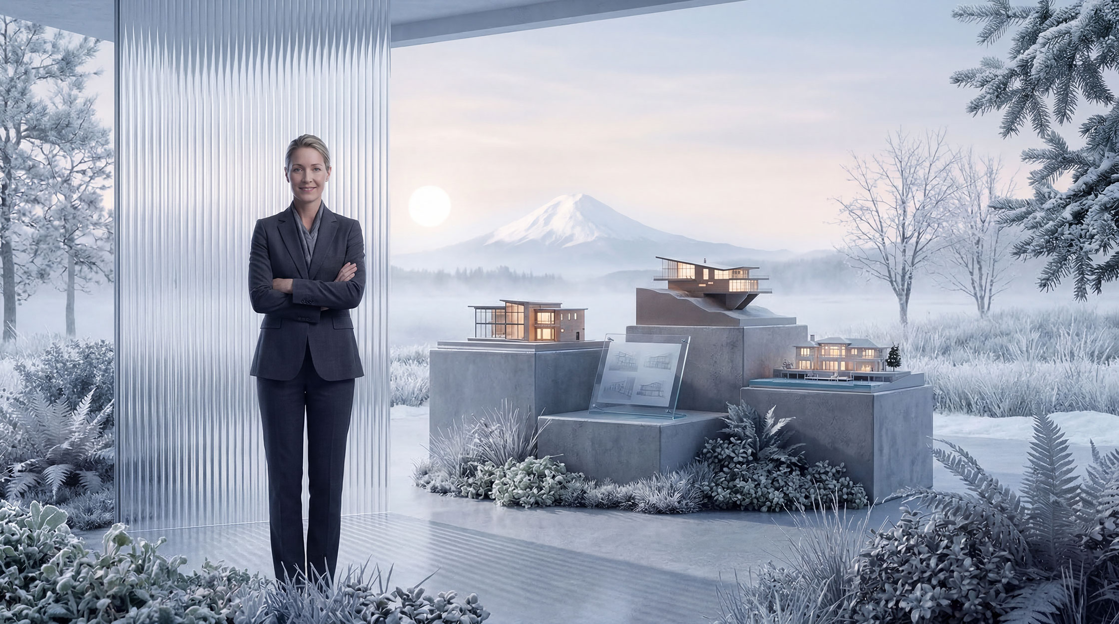
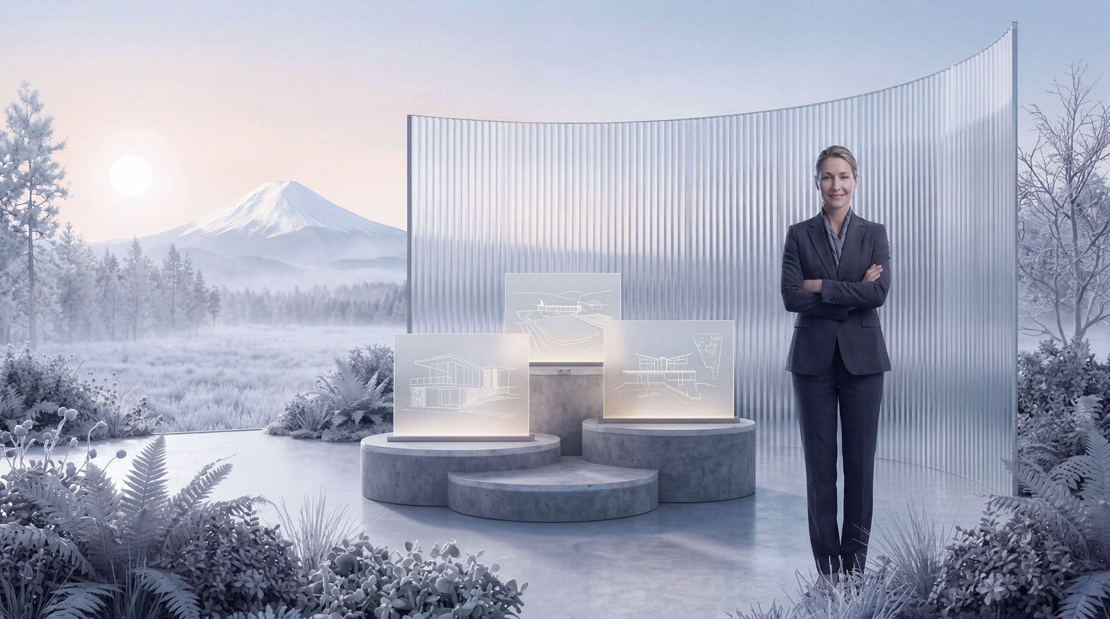
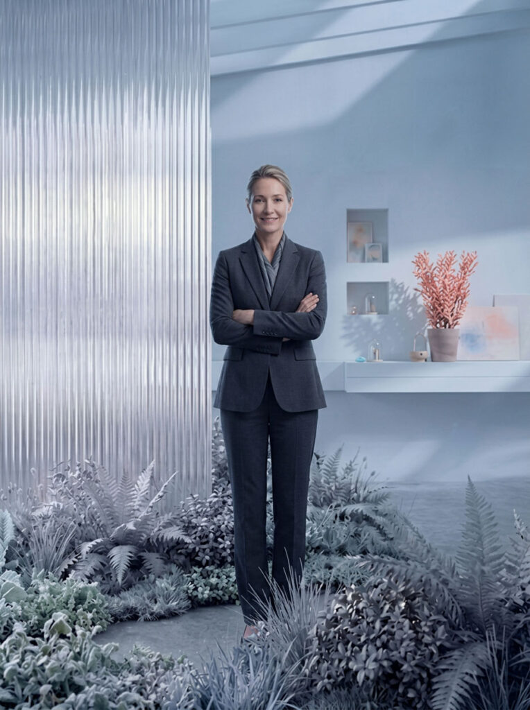
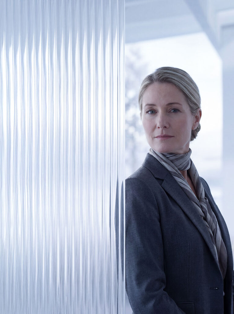
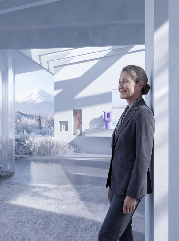
The world built for JG Real Estate didn’t begin with a brand brief — it began with a personality. At the center of this visual identity is a woman who spends her weekends on forest trails, who knows the particular silence of a PNW winter morning, who has stood at the edge of a misty mountain ridge and understood instinctively how space, light, and nature make you feel something. That lived experience became the creative foundation for everything you see here.
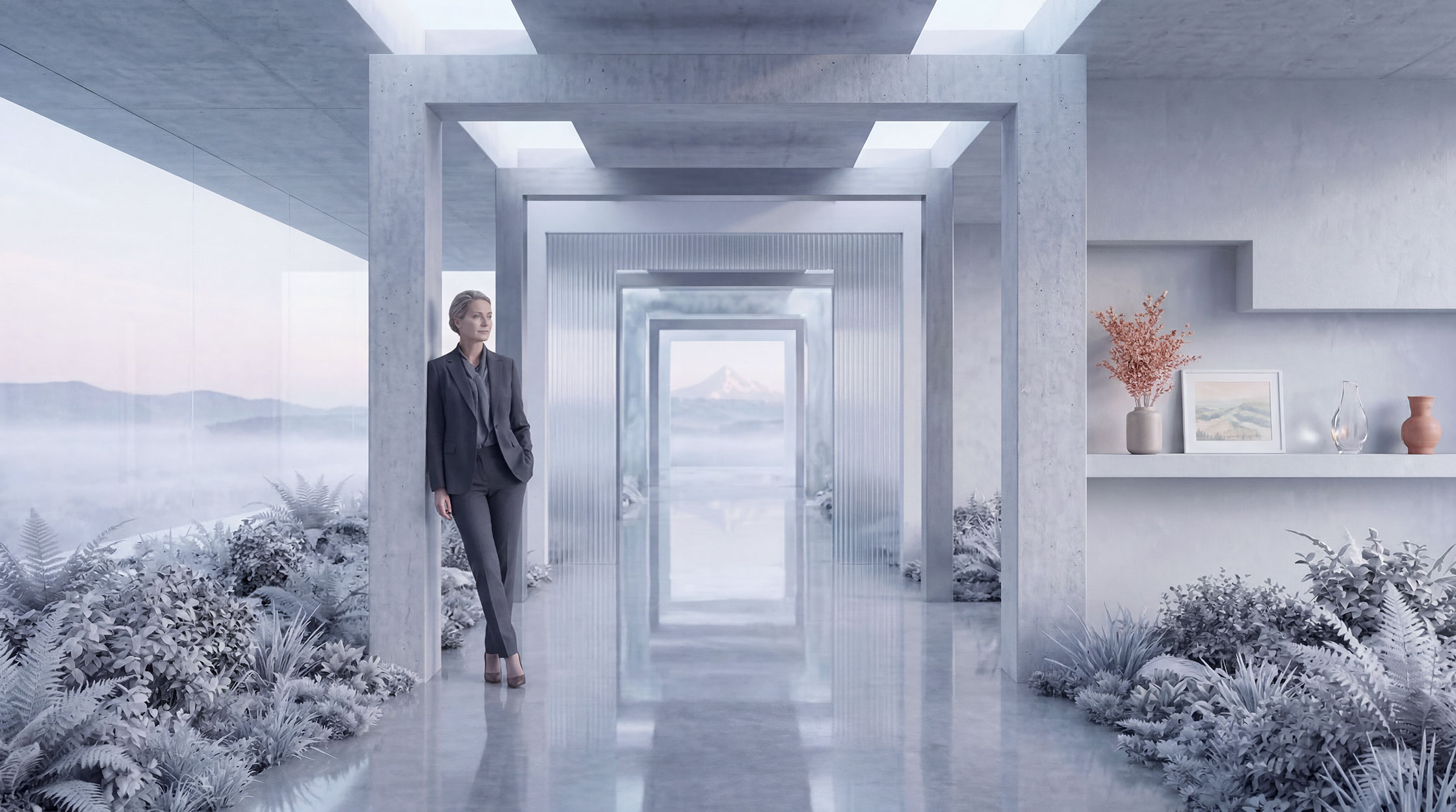
The directive was clear from the start: don’t build a brand that looks like real estate. Build a brand that looks like her. The result is a visual world pulled straight from the Pacific Northwest imagination — snow-dusted evergreens framing modernist architecture, a low winter sun hovering above volcanic peaks, frost-laced foliage pressing up against sculptural concrete and polished glass. These aren’t decorative choices. They are direct translations of how she moves through the world — with precision, with reverence for the natural environment, and with an artist’s eye for how man-made structure and wild landscape can coexist in extraordinary harmony.
Her deep love of art, architecture, and interior design gave the visuals their rigor and restraint. Her hiker’s soul gave them their wildness. And her imagination gave them the freedom to exist somewhere between the real and the cinematic — a world that feels entirely possible, and entirely hers.
The Creative Process: From Concept to Completion
The process opened with a single question: What does she see when she closes her eyes and imagines the perfect property? The answer came quickly and vividly — because for someone who hikes PNW trails in the dead of winter, who studies the geometry of tree canopies and the way light filters through frosted ferns, beauty has always been architectural. Nature already builds in clean lines, dramatic scale, and considered negative space. The creative vision simply translated that sensibility into brand imagery.
Mood boarding drew directly from her world: the blue-grey palette of a Pacific Northwest fog bank, the vertical drama of old-growth Douglas firs, the minimalist elegance of a modern home glimpsed through bare winter branches. These references shaped every compositional decision — the placement of architecture within landscape, the cool silver-white tone of the color grading, the deliberate choice to surround her with lush, frost-touched foliage rather than the sterile white backdrops common in real estate marketing.
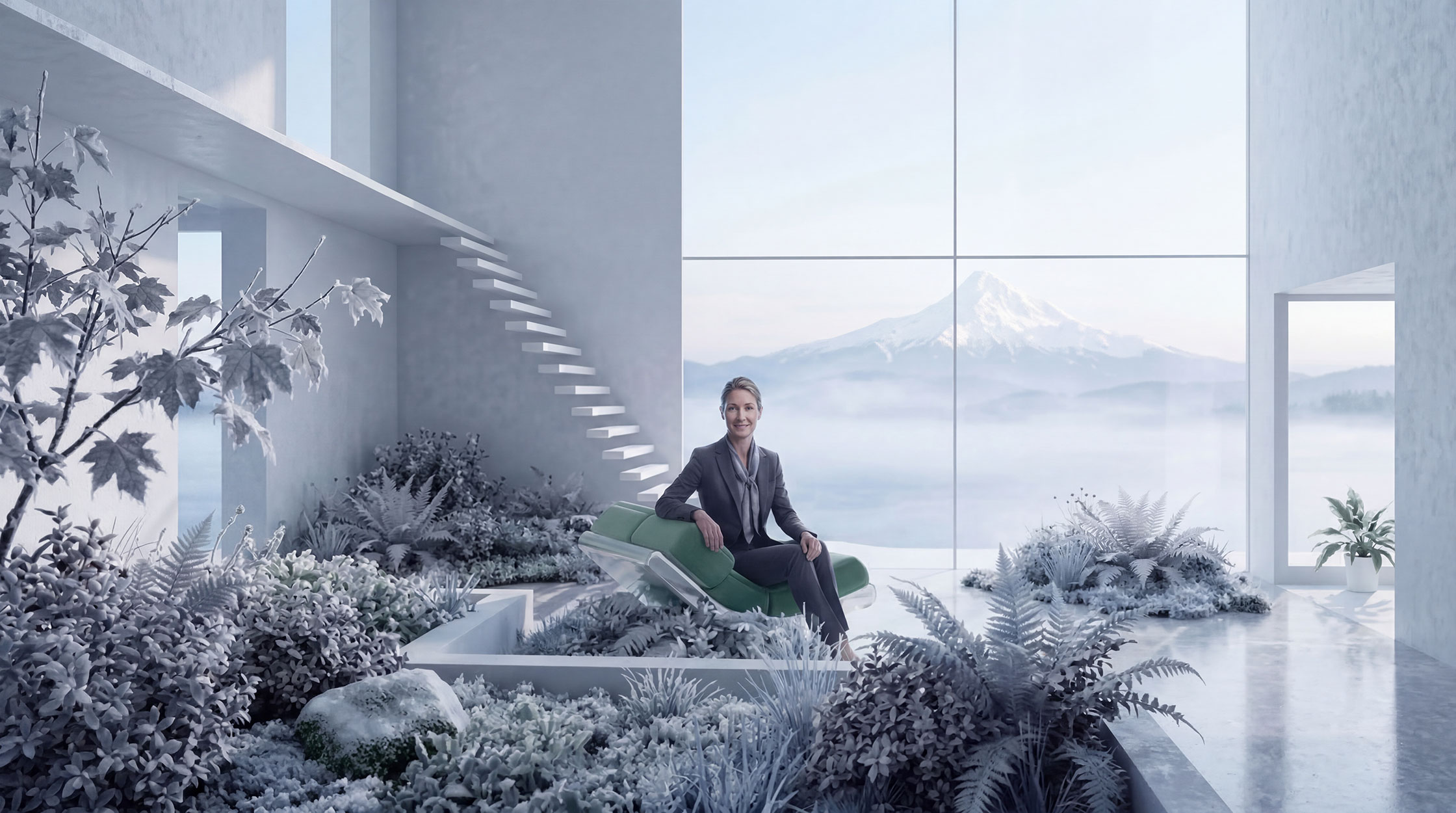
The interior scene in the second image was born from her love of interior design — the sculptural floating staircase, the oversized floor-to-ceiling glass framing a misty mountain view, the indoor garden overflowing with ferns and broad-leaf plants that blur the line between inside and outside. For someone who finds restoration in forests, the ideal home invites the forest in. That idea became the emotional core of the entire visual system.
Each asset was then adapted across website graphics and social media ad creatives — ensuring that whether someone encounters the brand on a desktop homepage or in a three-second Instagram scroll, they immediately feel the same thing: this agent understands something about space, nature, and beauty that most others don’t. That feeling is the brand. And it came entirely from her.