
Alder House Family Dentists
Family Dentists Marketing Visuals
CLIENT:
Alder House Family Dentists (Spec)
SERVICE
Art Direction Brand Imagery (world building visuals)
Website Graphics
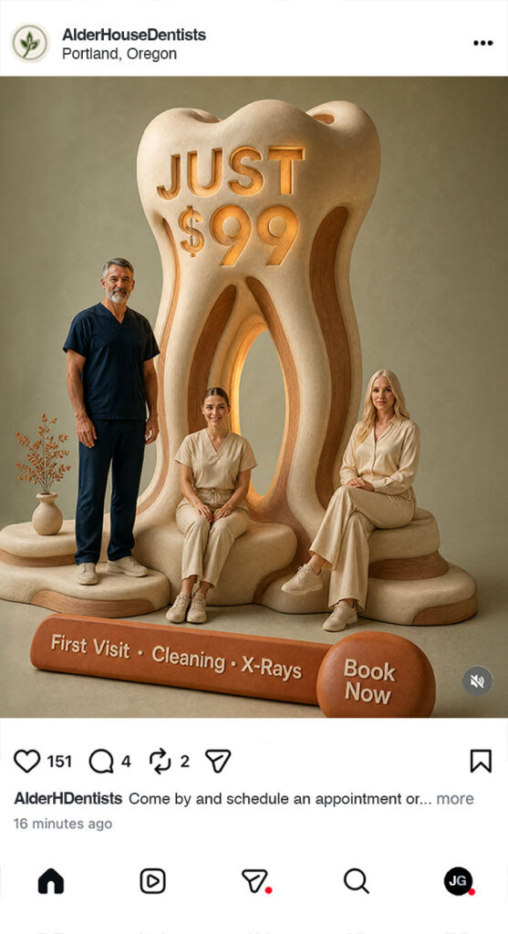
Social media Ad Creatives
Alder House Family Dentists is a spec Portland-based independent dental practice designed for families, young professionals, and anxious patients who want excellent care in an environment that feels calm, modern, and human. The spec brief positioned the brand as the antidote to both sterile chain clinics and over-luxurious boutique offices — somewhere that feels less like a transactional clinic and more like a thoughtfully designed home. The work began with one strategic question: how do you make a dental practice look unmistakably dental, instantly premium, and entirely unlike anything else in the category?
The answer became a full visual world. Rather than producing a handful of polished marketing images, the project built an end-to-end brand-imagery system — over 170 concepts spanning hyper-real still life, warm human-centered portraiture, Pacific Northwest lifestyle work, and surreal brand-mythology dreamscapes — all unified by a single hybrid visual language anchored in cinematic restraint, premium material craft, and the warm residential calm of the Pacific Northwest. The result is a deployable identity that gives an independent dental practice the brand presence usually reserved for hospitality and beauty: Aesop-grade discipline, Hermès-level craft, Kinfolk-style human warmth — applied to healthcare.
Brand Imagery
Great brands don’t explain themselves — they show themselves. Brand imagery is the art of building a visual world so distinct, so considered, and so true to the brand’s core idea that audiences understand exactly who you are the moment they encounter you.
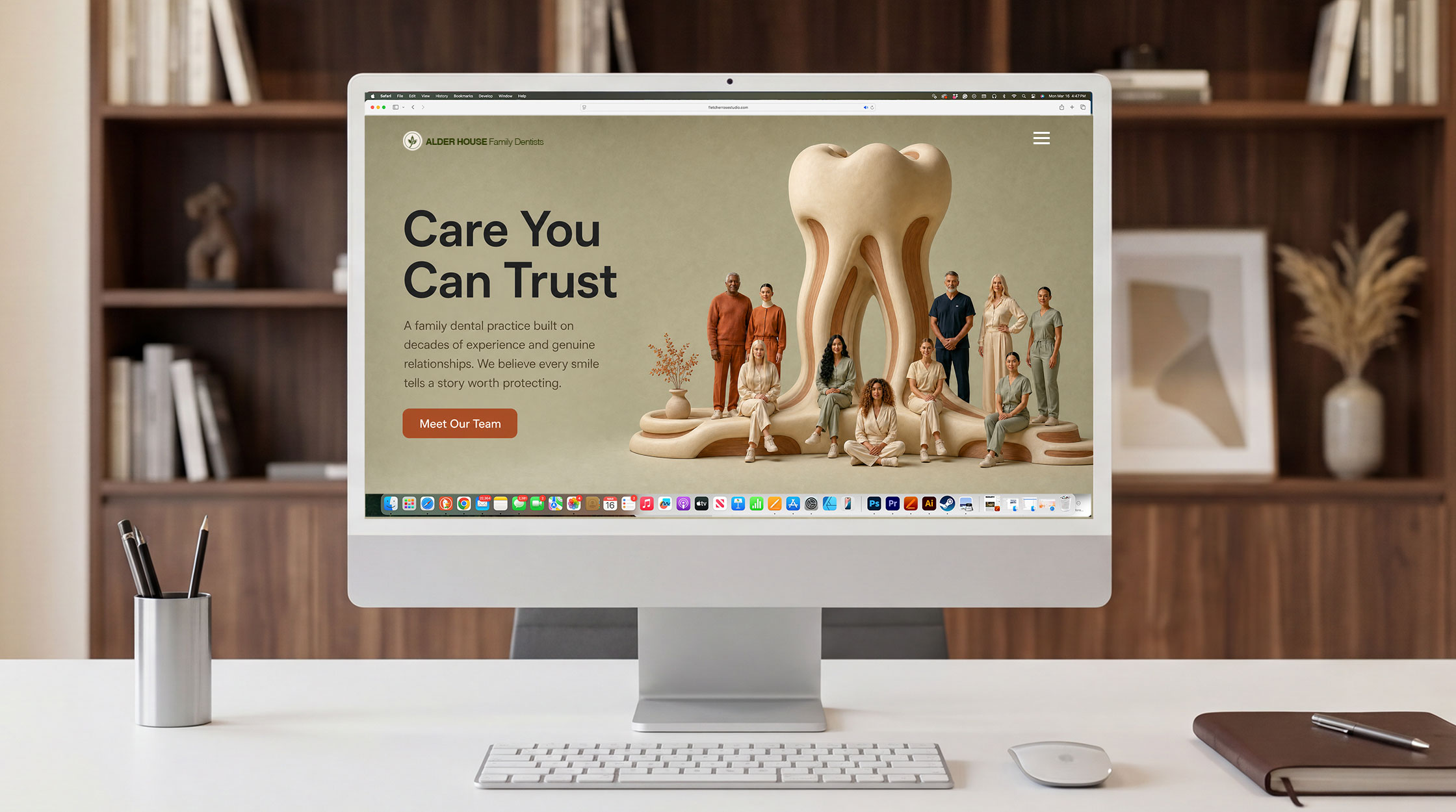
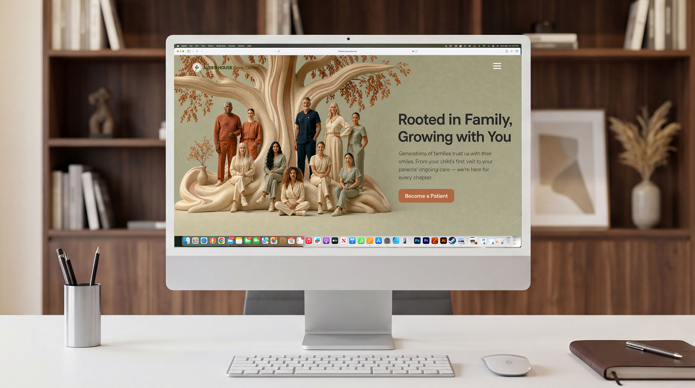
website hero landing page header
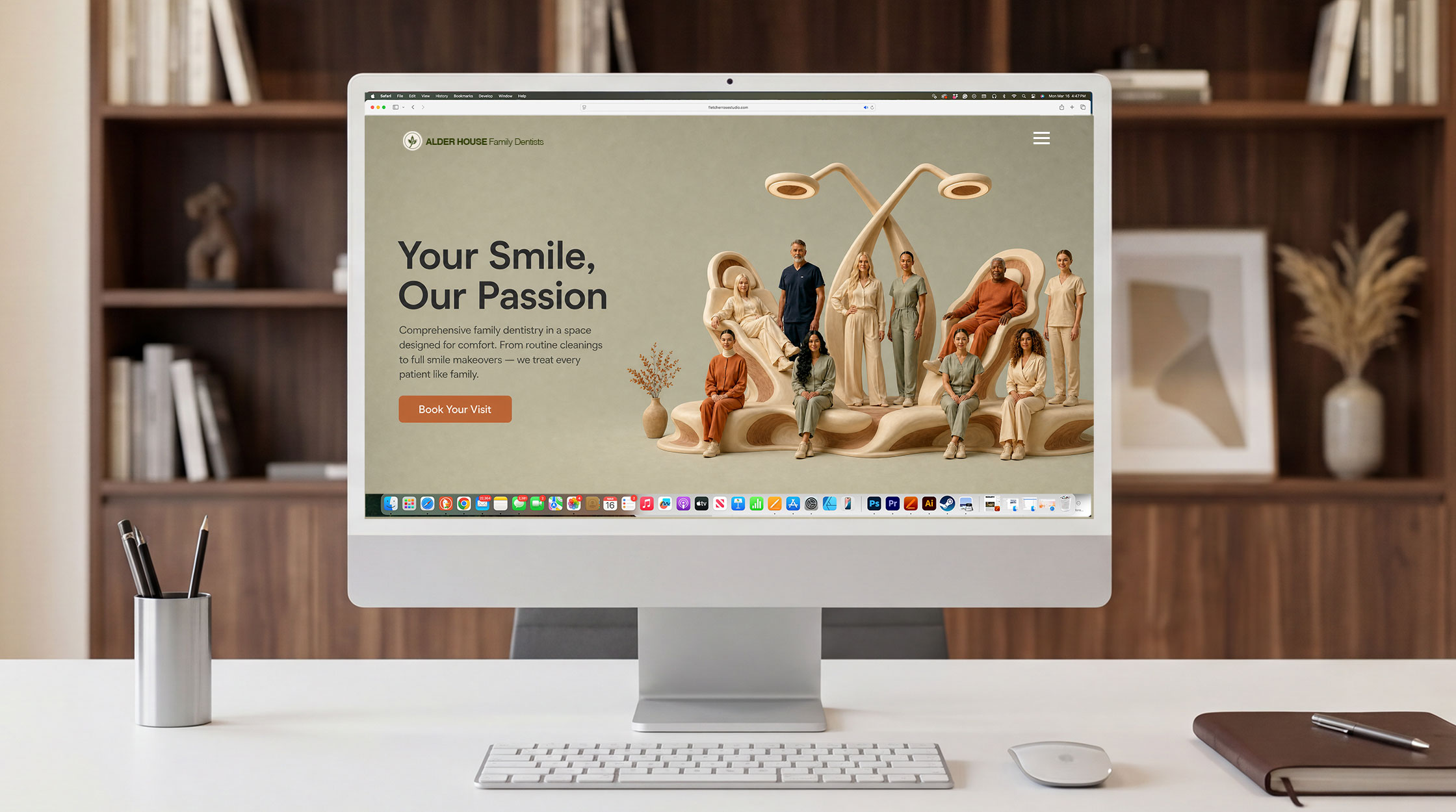
The hero header is where brands are won or lost. It is the first frame, the strongest visual argument, and the image a visitor carries with them long after they’ve left the page. With Fletcher Rose Studio’s AI-powered art direction, brands no longer have to choose between creative ambition and budget reality. Concept-driven world-building visuals — crafted with the precision of a Fortune 500 campaign — give a website’s hero section the kind of stopping power that transforms casual browsers into convinced buyers.
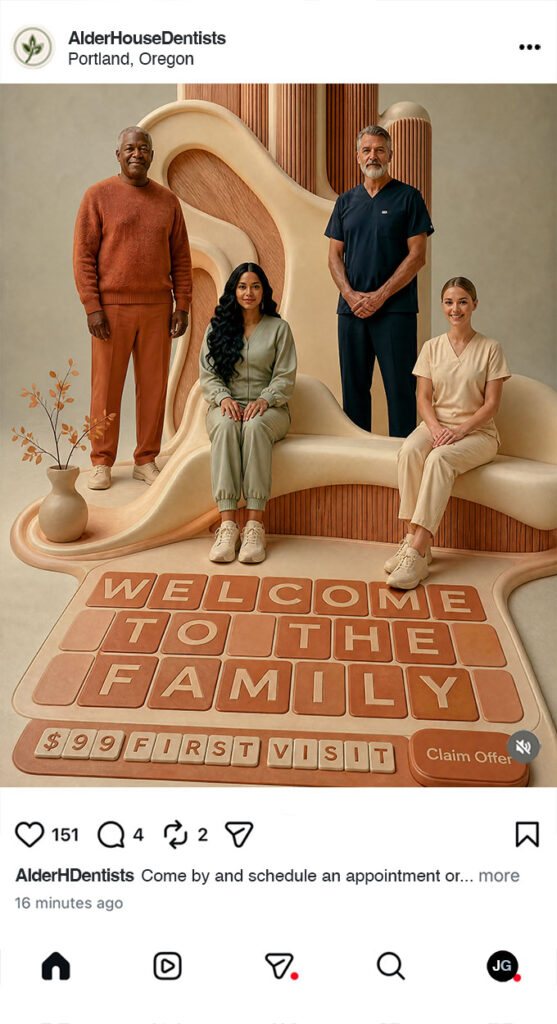
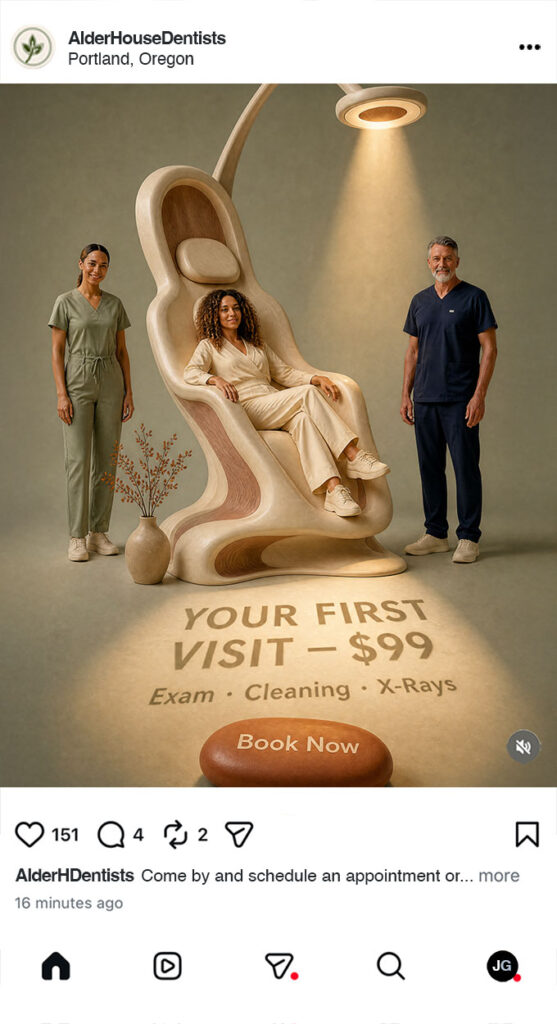
content creation Visual package
In a market where every agent is posting the same listing photos and the same smiling headshots, standing out isn’t about posting more — it’s about posting better. Fletcher Rose Studio’s AI-powered art direction and concept-driven artwork fundamentally changes what’s possible for a brand on social media, delivering Fortune 500-level visual storytelling at a fraction of traditional production costs.
Project Case Study
The Creative Vision:
The dental industry’s visual language is broken in two predictable ways. Chain clinics default to clinical sterility — bright whites, plastic instruments, stock-photo smiles — which signals competence but reads as cold, transactional, and slightly anxiety-inducing. Boutique practices over-correct toward generic luxury — soft beige, marble countertops, vague spa cues — which looks expensive but says nothing specific. Both lanes leave the most important audience underserved: families, young professionals, and anxious patients who want the precision of real dentistry delivered in an environment that feels calm, considered, and unmistakably human. Alder House began with the conviction that there was room for a third path.
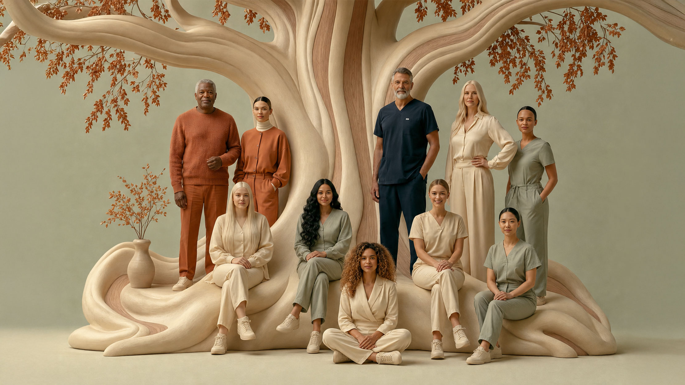
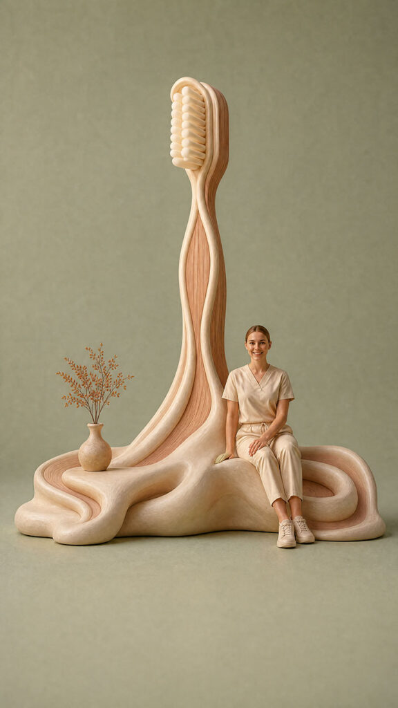
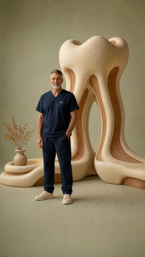
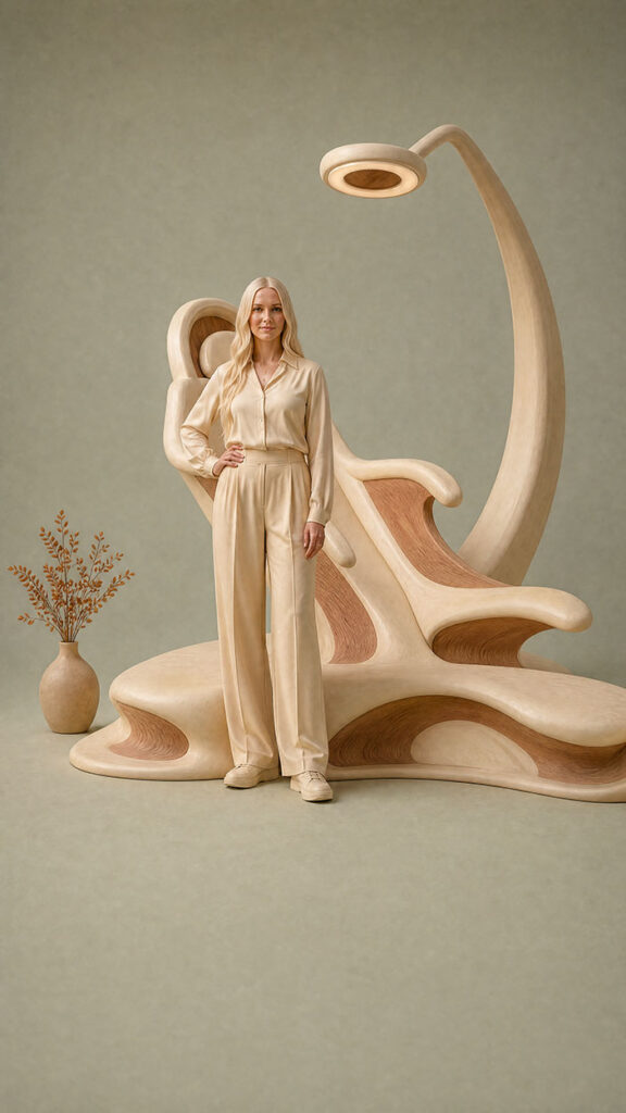
The creative vision became a clear principle: visible signal, invisible cliché. Every image had to read as obviously dental within seconds — not by hiding the practice behind abstraction, but by elevating its most familiar objects, moments, and materials to the level of fine art. The dental chair becomes a sculptural museum object. The smile becomes a composition of pearls and light rather than an anatomy of teeth. The dentist’s hand is staged with the dignity of a luxury watch campaign. The Pacific Northwest setting — alder trees, warm white oak, soft Portland morning light — anchors the work in a specific real place, not a generic premium nowhere. The result is a brand that looks Aesop-restrained, Hermès-crafted, and Kinfolk-warm — applied for the first time to healthcare.
The Creative Process: From Concept to Completion
Every brand world begins with a careful read of what the client actually needs — not what’s easy to produce. The Alder House brief asked for warmth without softness, premium without coldness, and dentistry without cliché. That meant working against the two defaults of the industry: the sterile clinical look and the generic luxury look. The first task was to translate those qualitative goals into a clear strategic principle the rest of the work could be measured against. The principle became visible signal, invisible cliché — every image must read as obviously dental within seconds, but the way it got there must feel completely fresh.
Before generating any imagery, I spent time mapping where the brand could live and — just as importantly — where it could not. Anything dark, cyberpunk, clinical, dystopian, aggressively maximalist, or coldly futuristic was filtered out immediately. What remained was a focused territory: organic, warm, Pacific Northwest, restrained but expressive, hyper-real but stylized. That narrow target became a creative constraint that made every subsequent decision sharper. Constraints don’t limit creative work — they focus it.
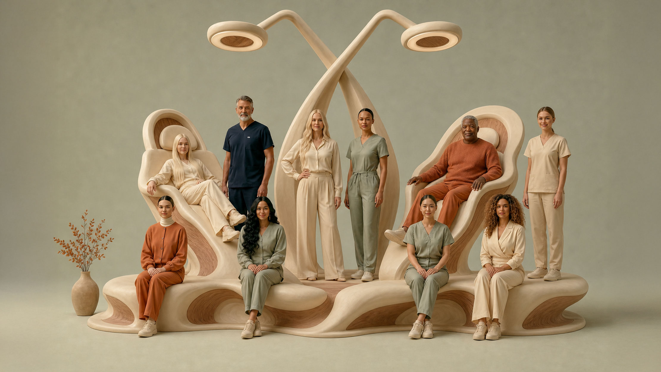
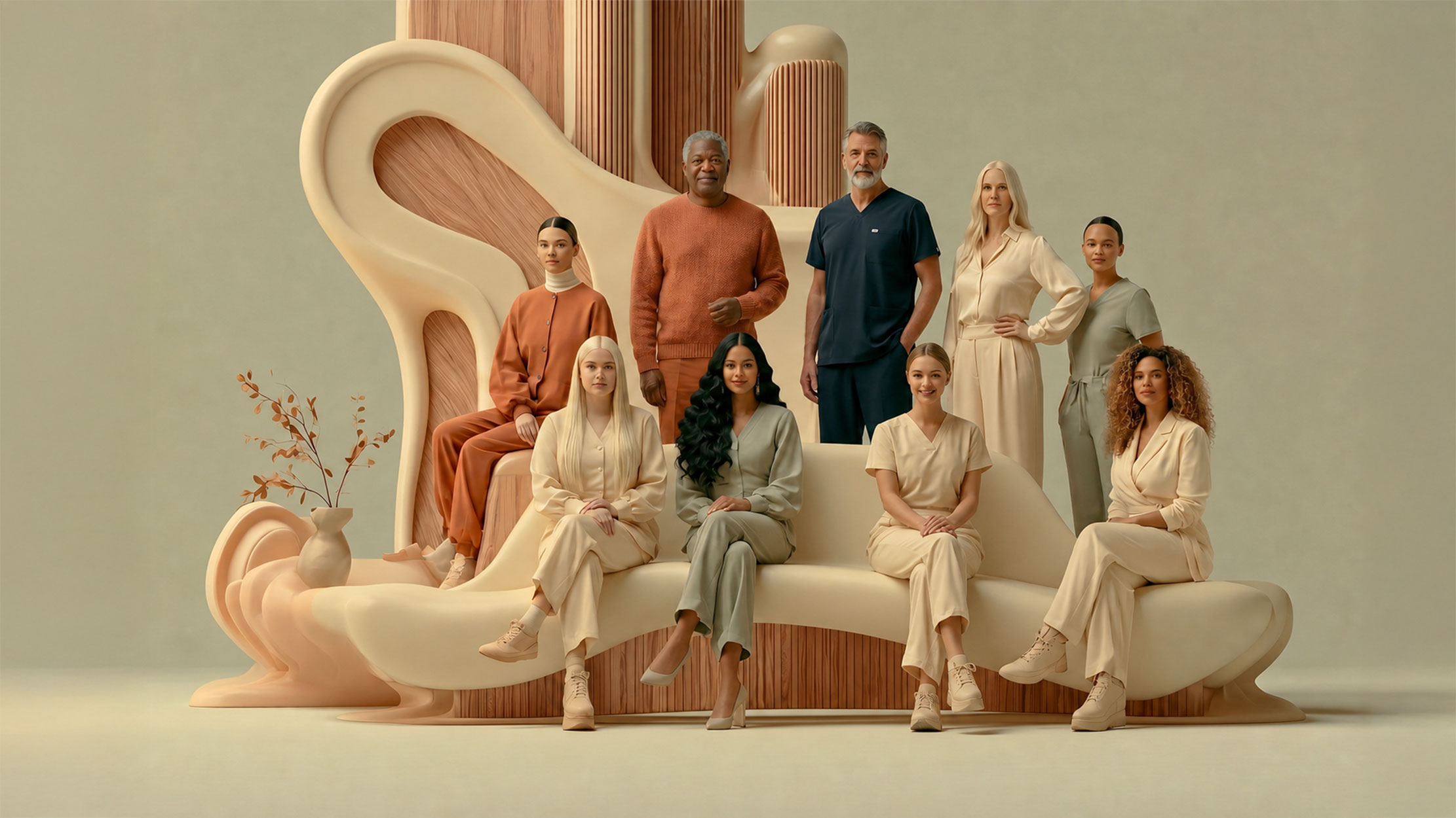
A brand world needs one consistent voice, no matter how many images it contains. I built that voice from three locked-in qualities: cinematic restraint in the composition, hyper-real craft in the materials, and warm humanity in the tone. Those three qualities became the brand’s visual DNA. Whether the asset was a still life of a single porcelain crown, a team portrait under window light, or a surreal dreamscape of the team inside a grove of alder trees, the same DNA carried through. That’s how a brand built across hundreds of images still reads as authored by a single hand.
Every successful image is a stack of intentional layers — and ignoring any one of them weakens the whole. For Alder House, I designed each asset around seven of them: a guiding metaphor, a hero scene, a defined palette of cream, moss green, warm clay terracotta, brushed brass and warm oak, hyper-real material choices, diffuse Portland morning light, considered cinematic composition, and a built-in plan for how the image would scale into other touchpoints. This layered approach made every image relate to every other one — and gave the brand a system that could grow without losing coherence.
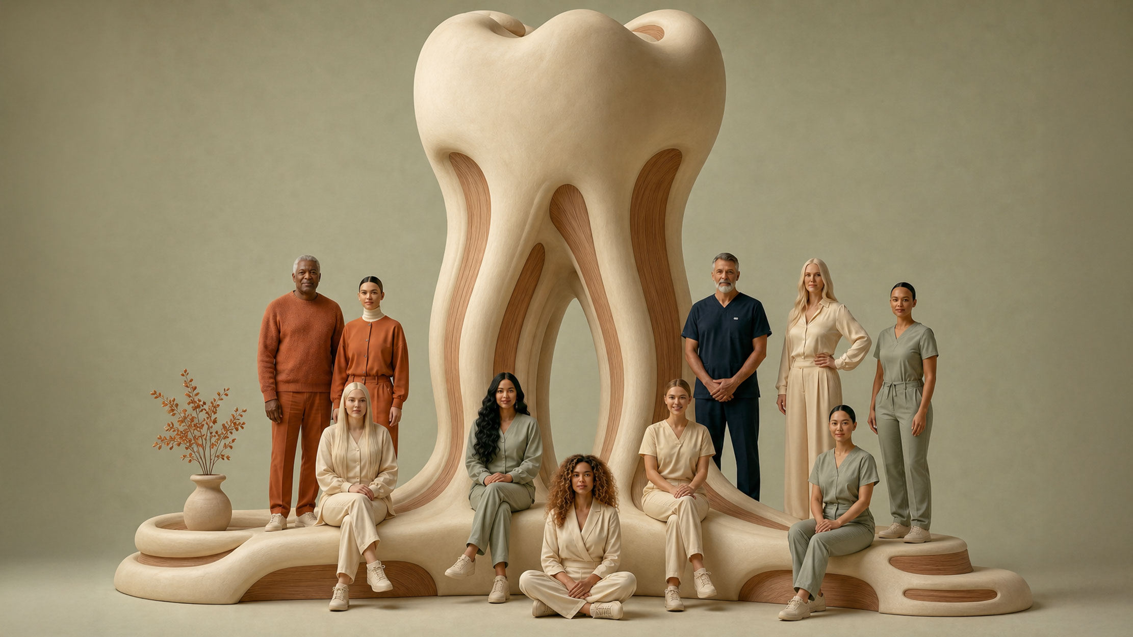
Every brand world needs a single defining image — the one that contains the whole idea. For Alder House, that became the Leaf-Tooth: a sculptural form that reads simultaneously as a translucent veined alder leaf and a smooth pearl-enamel tooth. The viewer sees botany first, then dentistry, then the smart blend of both. From this one kernel, the rest of the visual vocabulary scaled outward — the smile expressed as a curve of pearls rather than teeth, the dental chair rendered as museum-grade sculpture, the dentist’s hand staged like a luxury watch campaign. The dental signal stays explicit. The cliché disappears.
From the kernel, I built a complete deployable system across every touchpoint a practice would actually need: homepage hero imagery, anchors for hygiene, cosmetic, pediatric and restorative service pages, an extensive still-life library of dental objects elevated to luxury-product photography, a warm team portrait set, outdoor lifestyle imagery placing the brand inside its Portland neighborhood, and a tier of surreal brand-mythology dreamscapes for billboards, campaigns and press. Every asset shares one unified visual handwriting. Color discipline, light discipline, material discipline, composition discipline — all locked across the entire library so the brand reads as authored, not assembled.
The result is a complete brand identity that gives an independent dental practice the visual presence usually reserved for hospitality and beauty brands — disciplined restraint, fine material craft, genuine human warmth — all in service of healthcare. The system is built to scale: the same DNA holds at favicon and billboard, the same emotional tone holds at homepage and Instagram tile. For Alder House, the visuals aren’t decoration. They’re how a small practice signals taste, calm, and competence before a patient has read a single word — and how a designer earns the kind of trust that turns a one-time visit into a generational relationship.