
BURNHAM NETWORK SOLUTIONS
Website Design and Marketing MATERIAL
CLIENT:
BURNHAM NETWORK SOLUTIONS
SERVICE
Art Direction Brand Imagery (world building visuals)
Website Design
MARKETING MATERIAL
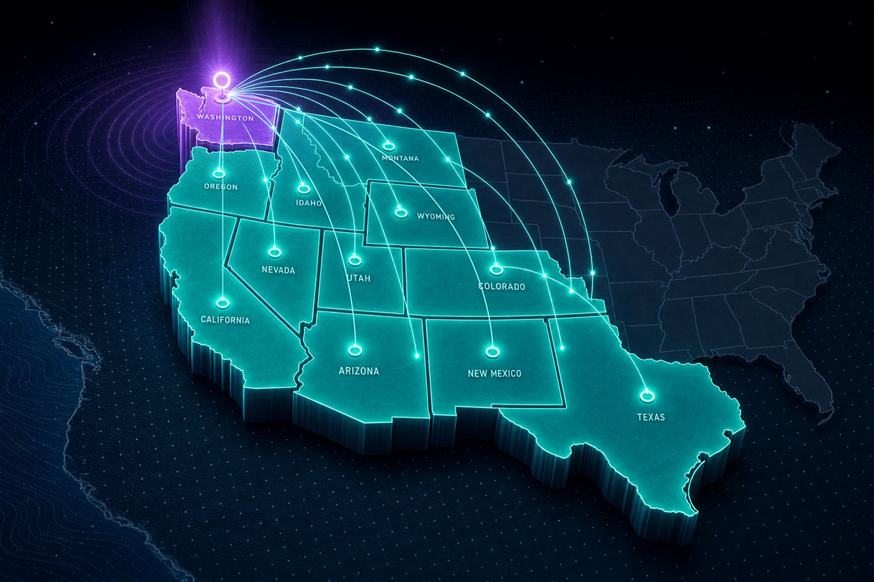
Burnham Network Solutions is a Seattle-based technology and infrastructure company serving businesses across 12 Western states. Their offer is simple and rare: one trusted partner for everything a modern facility runs on. That covers IT support, network cabling, surveillance, emergency phone systems, internet brokerage and even the general contracting that builds the space itself. They had outgrown a visual identity that made them look like just another cabling contractor, and they came to us to bring the brand in line with the business they had become.
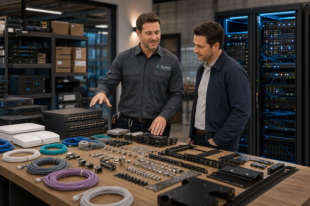
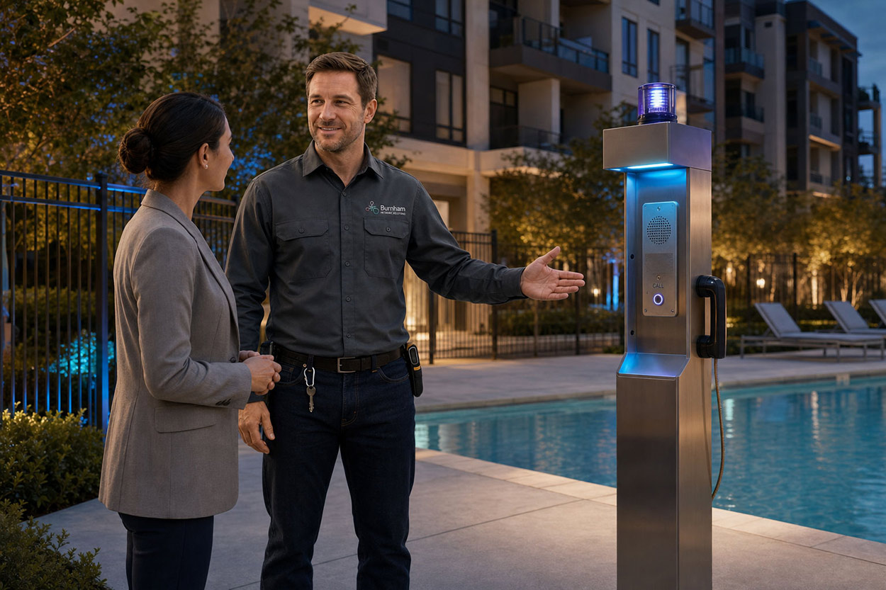
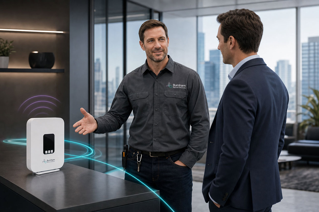
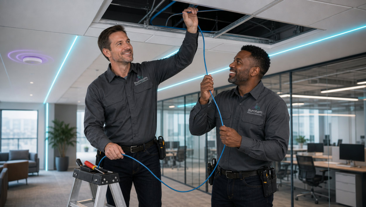
We led art direction, built a library of brand imagery, designed a new website and created marketing material to match. The imagery gave every one of their services a consistent look, from 5G business internet to their mobile surveillance tower. The goal was a brand that feels premium, modern and dependable. When a facility manager or property owner lands on the site, they should understand right away that BNS can handle the whole picture.
Brand Imagery
Great brands don’t explain themselves — they show themselves. Brand imagery is the art of building a visual world so distinct, so considered, and so true to the brand’s core idea that audiences understand exactly who you are the moment they encounter you.
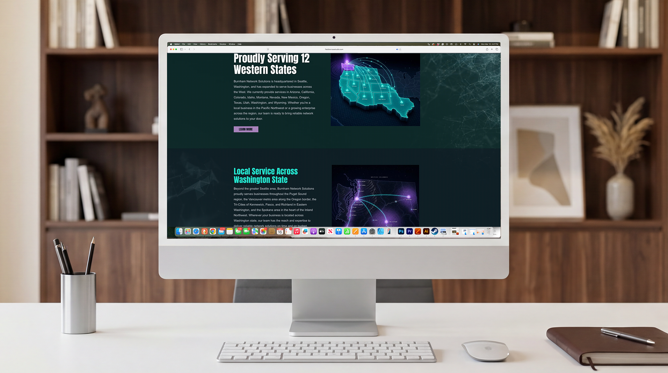
website Design
The hero header is where brands are won or lost. It is the first frame, the strongest visual argument, and the image a visitor carries with them long after they’ve left the page. With Fletcher Rose Studio’s AI-powered art direction, brands no longer have to choose between creative ambition and budget reality. Concept-driven world-building visuals — crafted with the precision of a Fortune 500 campaign — give a website’s hero section the kind of stopping power that transforms casual browsers into convinced buyers.
SALES TRAINING MATERIAL
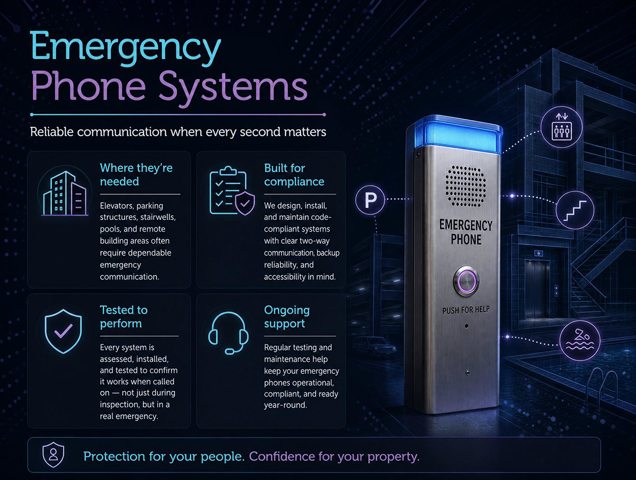
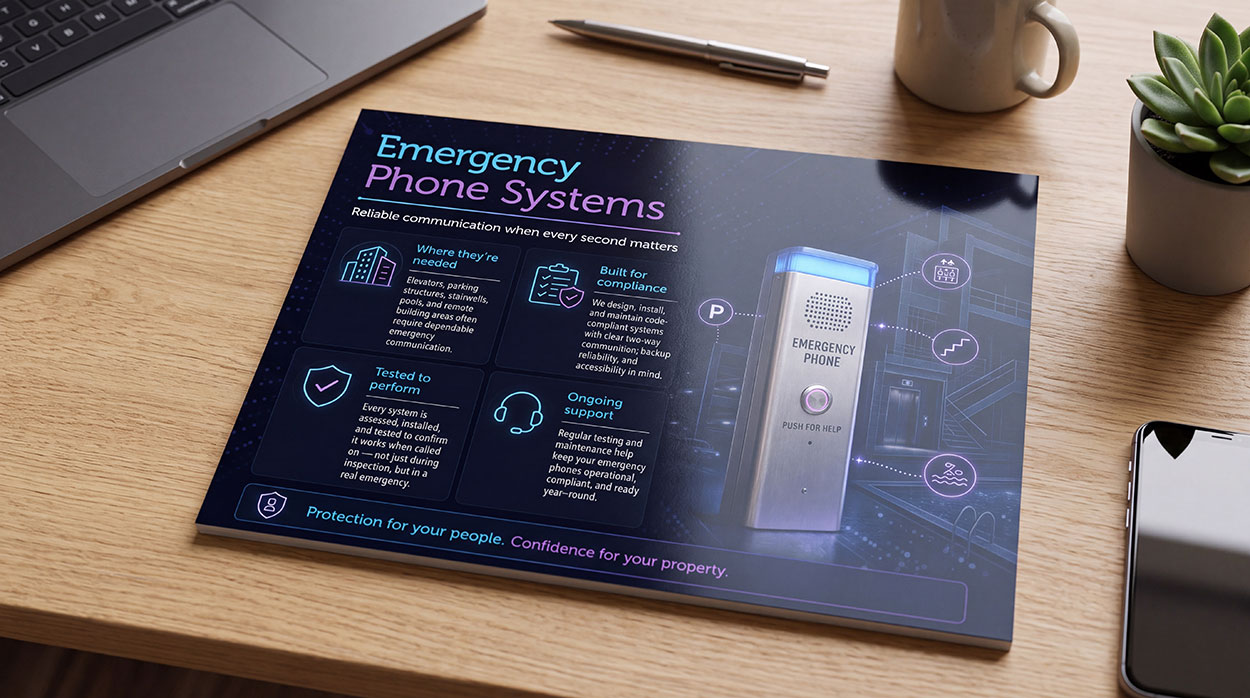
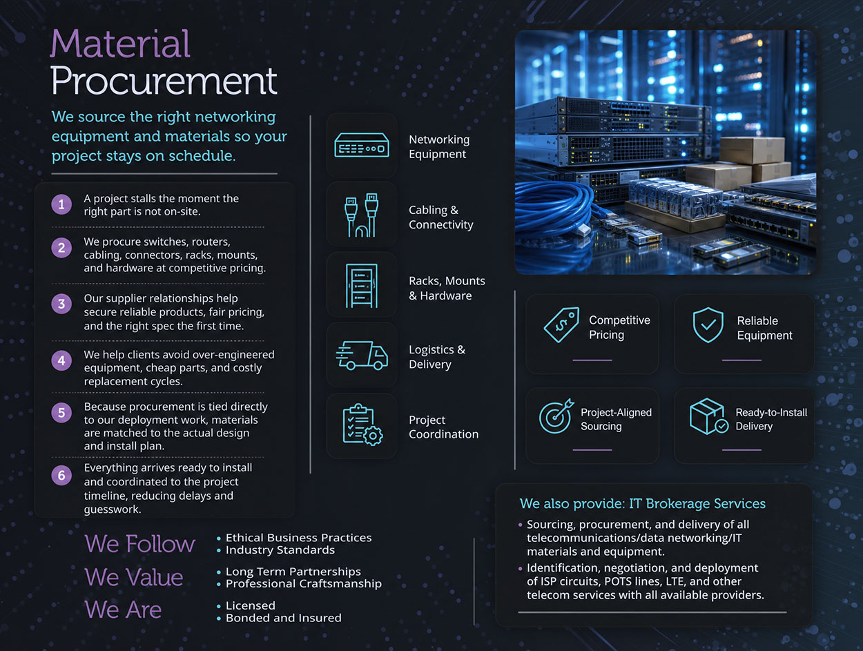
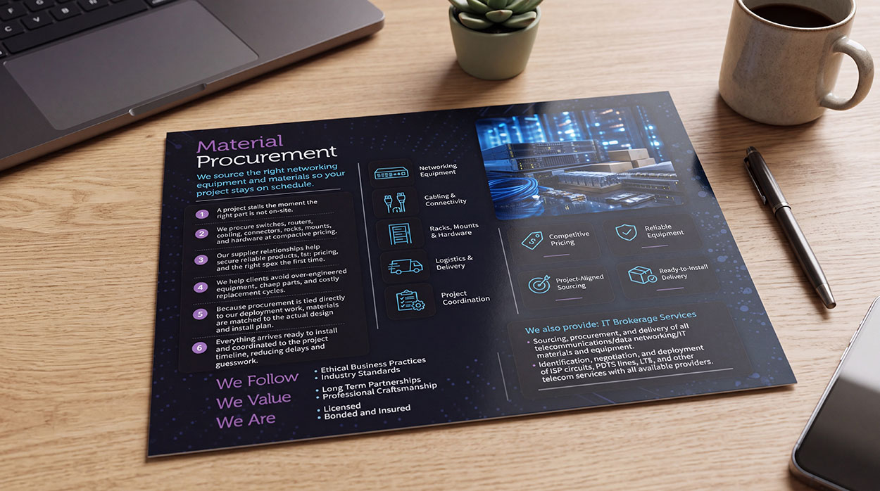
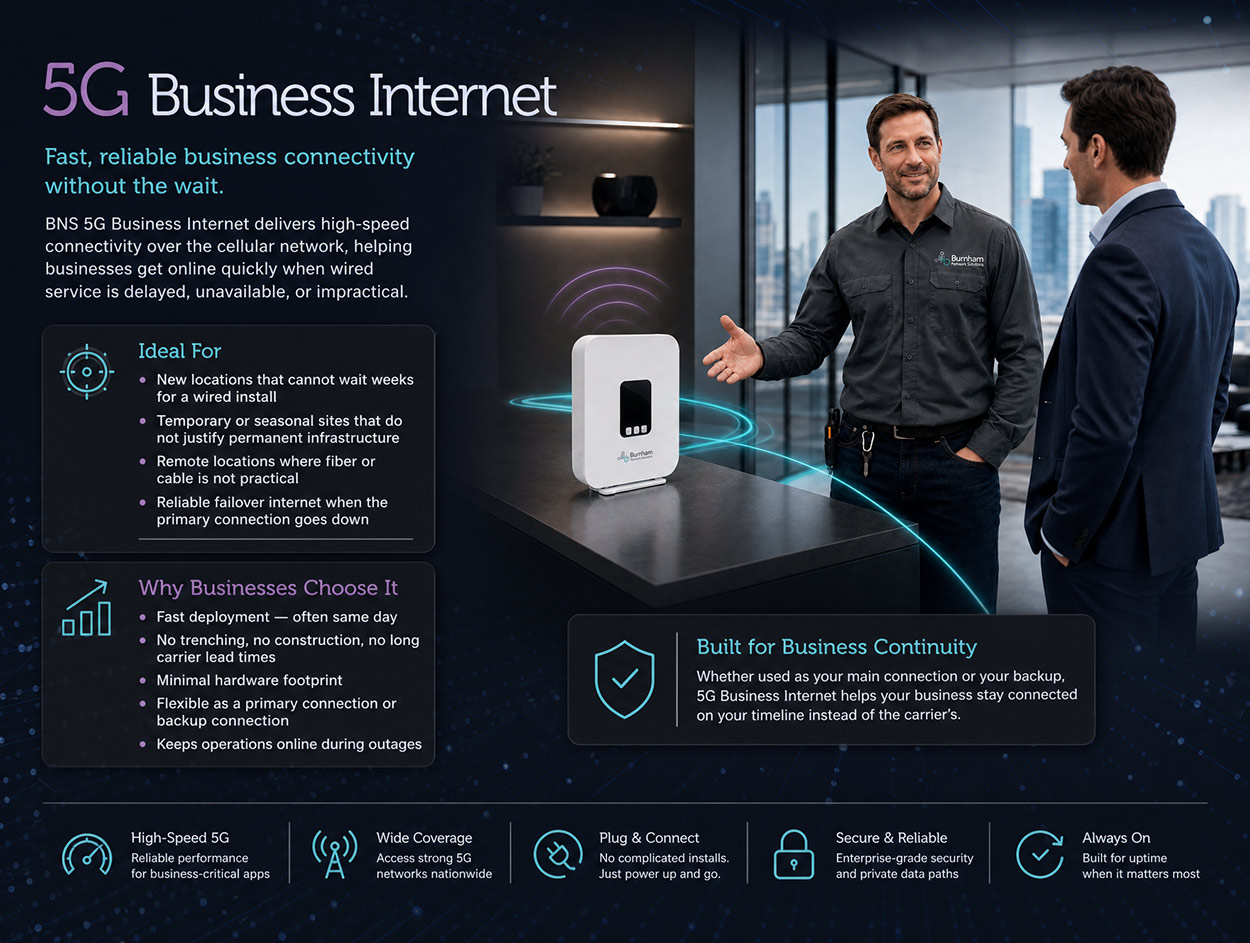
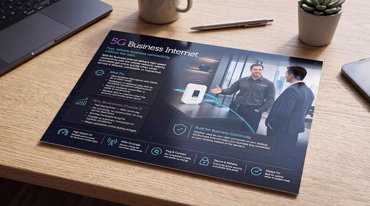
We turned the BNS brand story into training material for their sales team. It gives them a clear pitch, service-by-service talking points and visuals that match the website, so every customer conversation sounds and looks like BNS.
Project Case Study
The Creative Vision:
The vision started with a detail most people would overlook: the Burnham logo. BNS is a networking company, but its mark isn’t a circuit or a signal icon. It’s an organic molecule, chosen to show that the company was built on connection, structure and long-term relationships. That idea became our creative north star. We set out to build a visual world where technology feels human, and where every image says “everything here is connected, and it all works together.”
Most telecom and IT brands lean on generic stock photos of server rooms and tangled cables. We went the other way and created a world of polished, cinematic scenes, with clean infrastructure, confident lighting and real environments like job sites, parking structures, offices and remote facilities. Each image shows a service in the place it actually works. Together they read as one ecosystem, which mirrors the client’s promise to replace a crowd of vendors with one accountable team.
The Creative Process: From Concept to Completion
We started by getting to know the business behind the brand. In early sessions we explored the BNS story: why it was founded, why relationships come first, and the frustration their customers feel when they have to juggle many vendors. We also looked at the market. Most competitors relied on technical jargon and forgettable imagery, which gave BNS a clear chance to stand out by looking like the premium, all-in-one partner it already was.
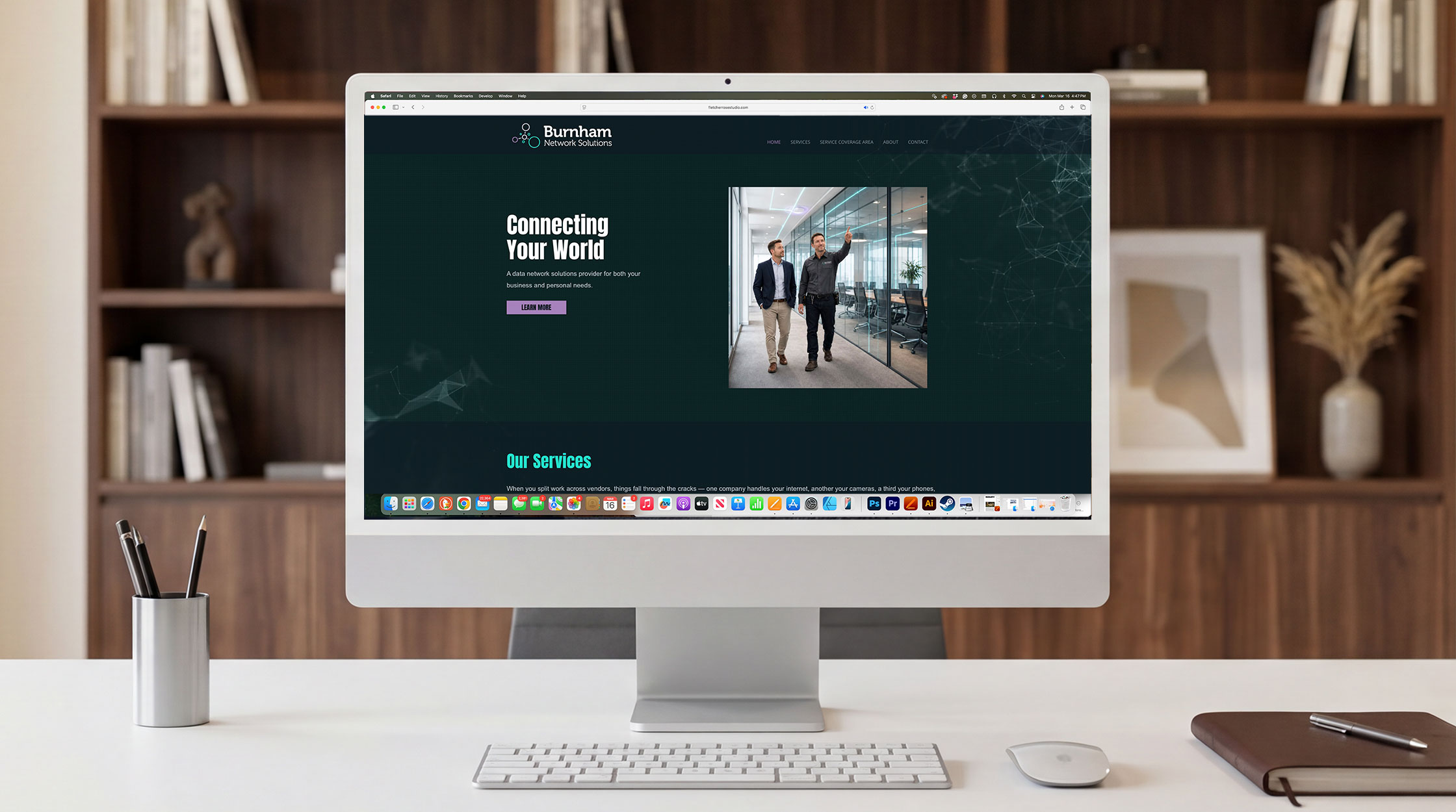
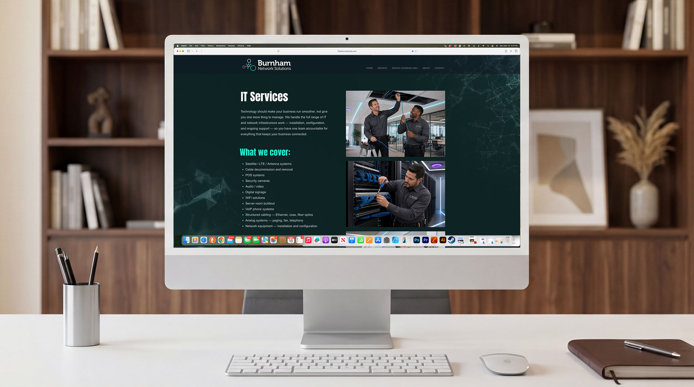
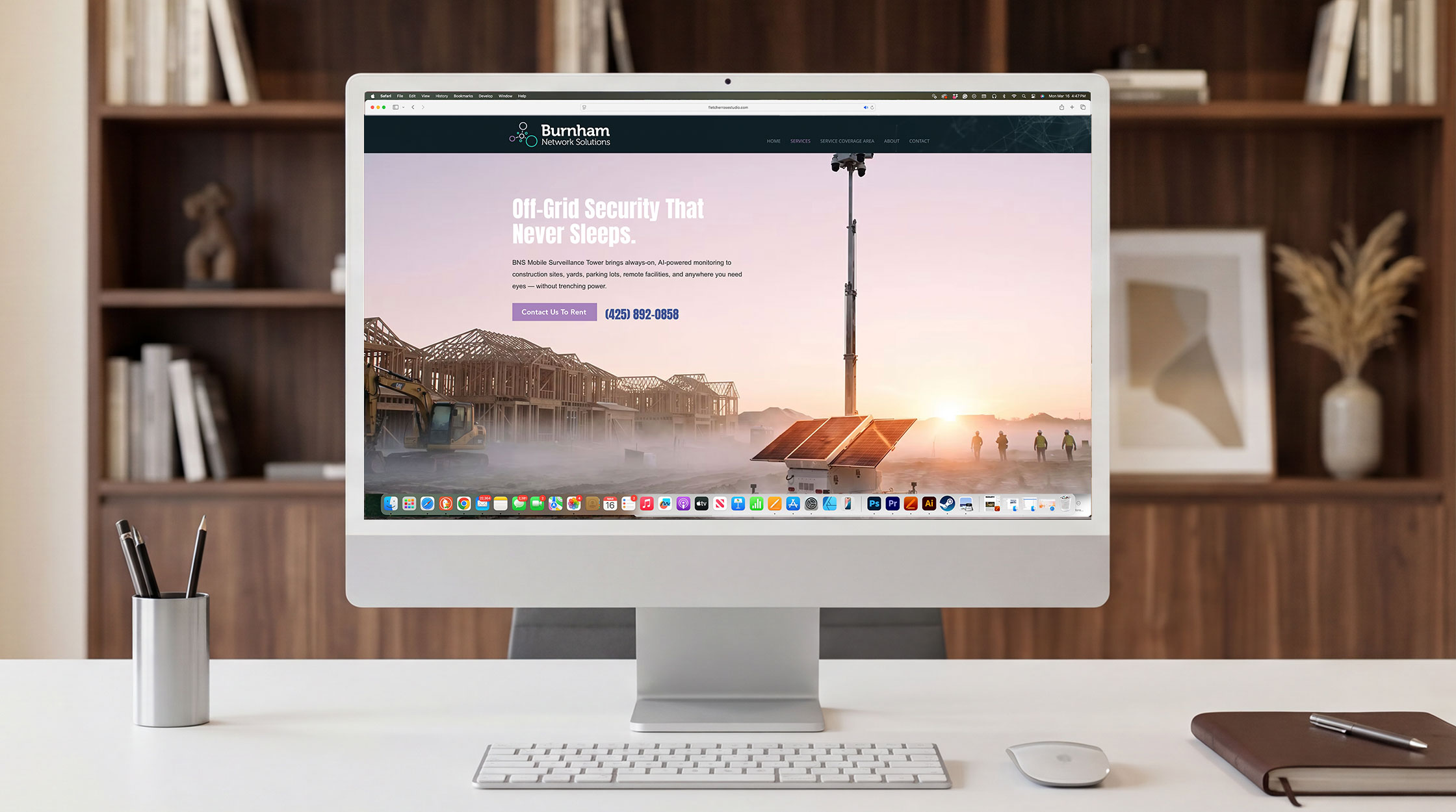
Art Direction & World Building Next we defined the visual language: a cohesive palette, a lighting style, how scenes are composed and a consistent mood across every image. We then built a hero visual for each service line, including IT services, material procurement, the mobile surveillance tower, emergency phone systems, internet brokerage, general contracting and 5G business internet. Every visual followed the same rules, so the full set reads as one brand world rather than a collection of separate pictures.
Website Design With the imagery in place, we designed a website built around the client’s core message: one team, one point of contact, every service under one roof. The structure leads visitors from the big-picture value straight into clearly separated services, with copy written in plain language rather than technical jargon. The new imagery does much of the work, so a visitor can see what BNS offers at a glance and then reach out with confidence.
Marketing Material & Launch To finish, we carried the brand world into marketing material, so BNS would look the same everywhere it appears, from sales conversations to service pages. The result is a brand that finally matches the company’s ambition. It is polished enough to win larger commercial projects and personal enough to reflect the relationship-first values it was founded on. As BNS keeps growing across the country, it now has a visual identity that can grow with it.