
CLIENT:
Moss & Motion Physical Therapy (Spec)
SERVICE
Art Direction Brand Imagery (world building visuals)
Website Graphics
Social media Ad Creatives
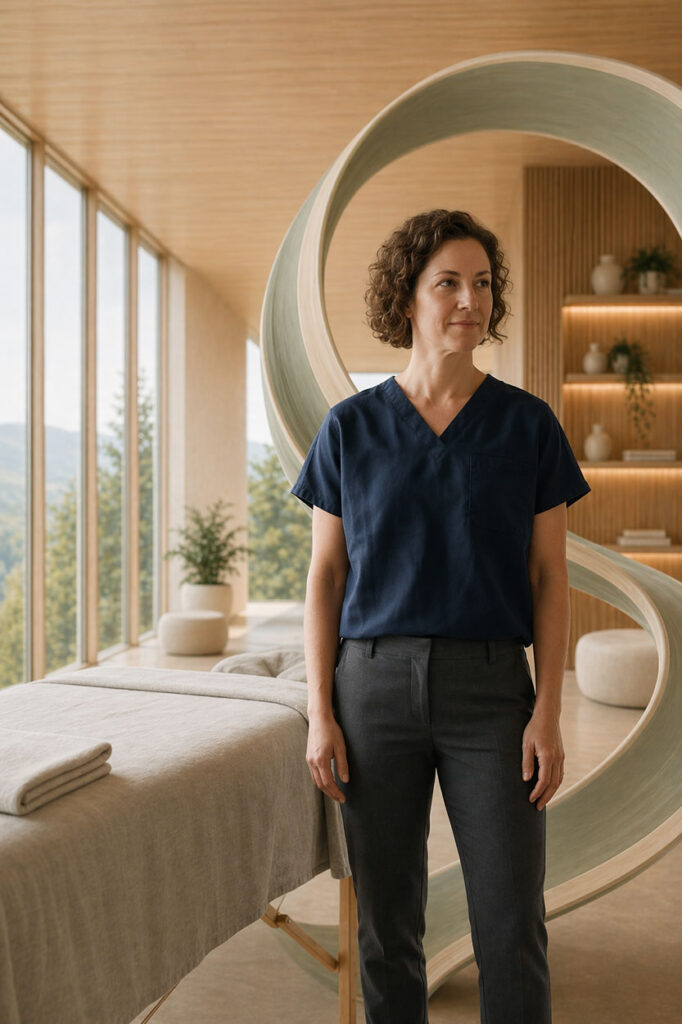
Moss & Motion Physical Therapy was developed as a spec brand concept to show how a wellness-based healthcare practice can feel more elevated, trustworthy, and emotionally resonant through premium visual direction. The goal was to move beyond sterile, overly clinical industry conventions and instead build a brand world that communicates recovery as something calm, intentional, and deeply human.
This visual system was created to support a modern physical therapy practice across web, social, and digital marketing touchpoints. Every asset was designed to reinforce the same message: that healing can feel supportive, expert-led, and beautifully considered. By combining environment-driven imagery, refined art direction, and a clear brand atmosphere, the project demonstrates how physical therapy marketing can create immediate trust while setting a practice apart from more generic competitors.
Physical therapy clinics can gain a major competitive advantage from AI-powered art direction by presenting their practice as more modern, trustworthy, and emotionally reassuring from the very first impression. For a brand like Moss & Motion, that means replacing generic, sterile healthcare visuals with a cohesive world of calm interiors, guided movement, natural light, and premium wellness-driven imagery that helps potential clients feel safe, supported, and confident in the clinic’s expertise. Fletcher Rose Studio’s approach also allows clinics to create a consistent visual identity across websites, social media, ad creatives, and campaign assets, so the brand feels established everywhere a patient encounters it. Just as importantly, AI-powered workflows make it possible to explore and refine multiple creative directions in real time—without the cost, scheduling, and production limits of repeated photo shoots—while still maintaining a polished, unified look that elevates perceived value, improves differentiation, and helps convert more inquiries into booked appointments.
Brand Imagery
Great brands don’t explain themselves — they show themselves. Brand imagery is the art of building a visual world so distinct, so considered, and so true to the brand’s core idea that audiences understand exactly who you are the moment they encounter you.
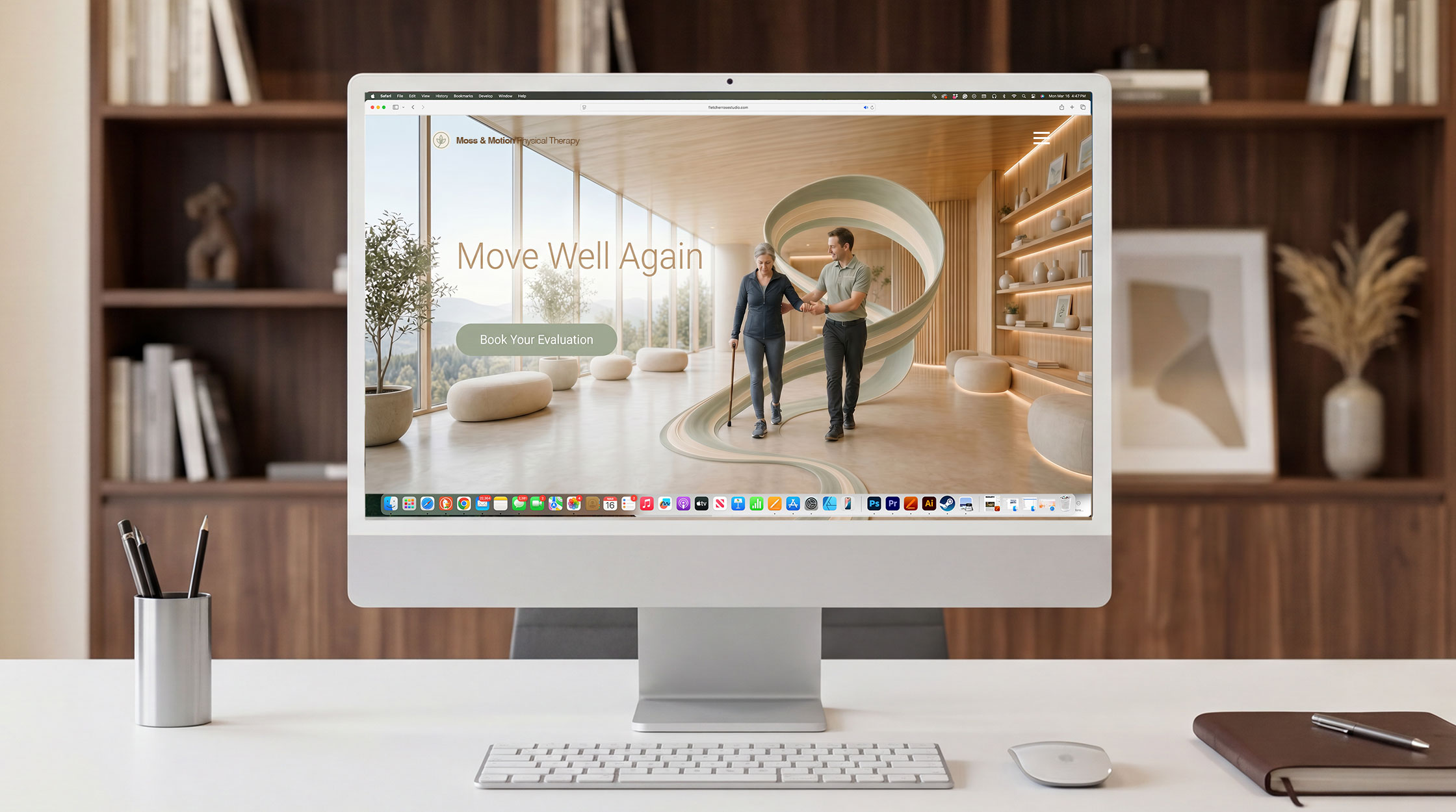
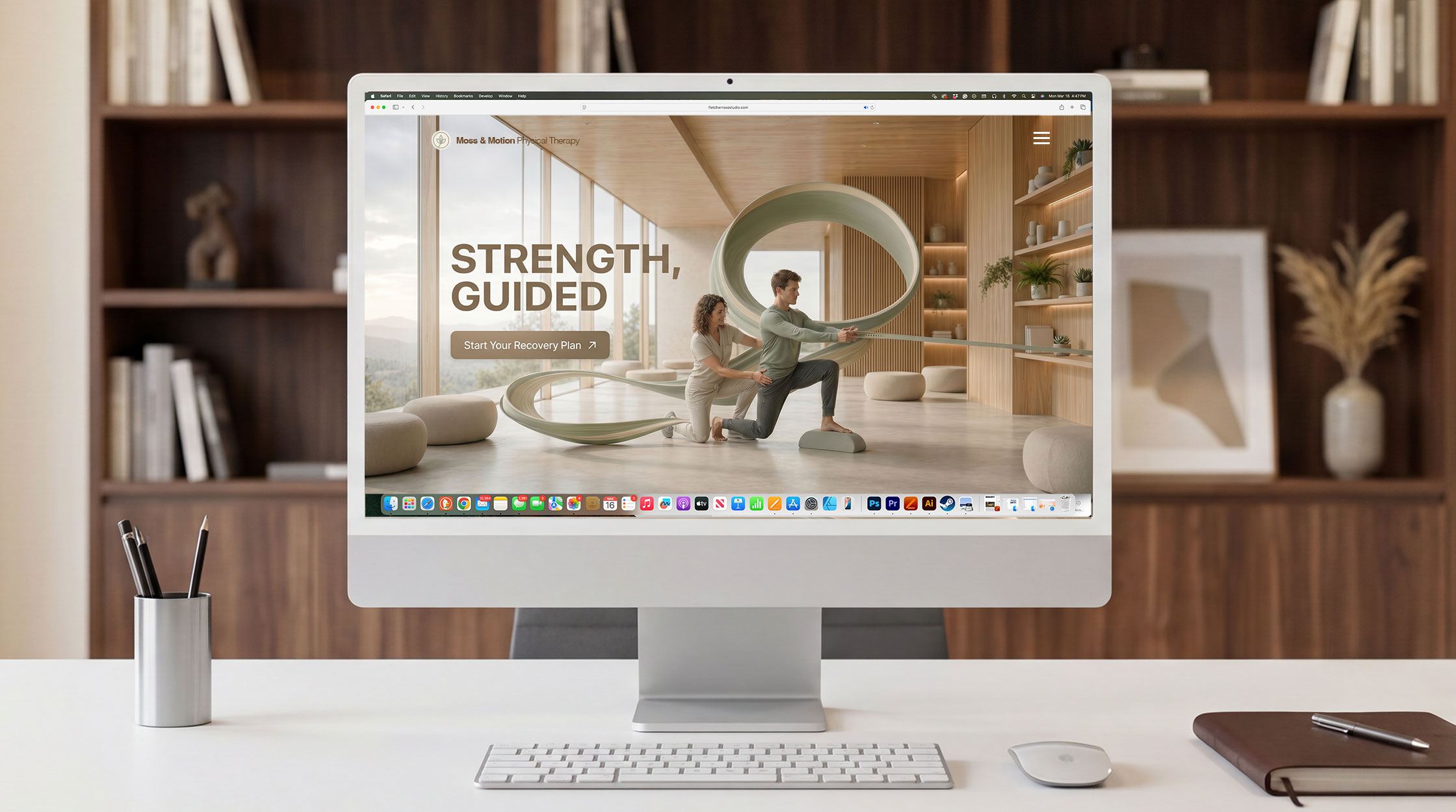
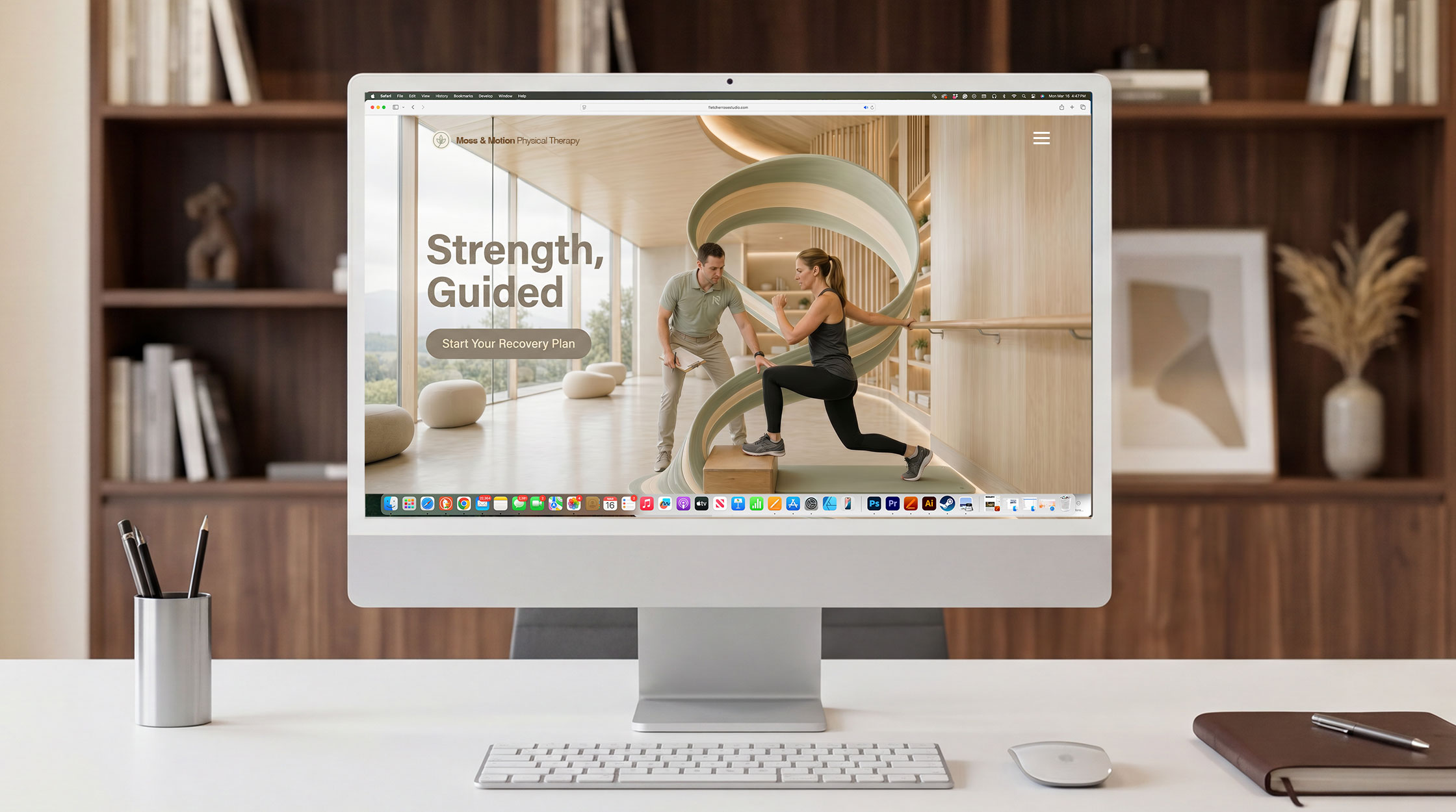
website hero landing page header
The hero header is where brands are won or lost. It is the first frame, the strongest visual argument, and the image a visitor carries with them long after they’ve left the page. With Fletcher Rose Studio’s AI-powered art direction, brands no longer have to choose between creative ambition and budget reality. Concept-driven world-building visuals — crafted with the precision of a Fortune 500 campaign — give a website’s hero section the kind of stopping power that transforms casual browsers into convinced buyers.
content creation Visual package
In a market where every agent is posting the same listing photos and the same smiling headshots, standing out isn’t about posting more — it’s about posting better. Fletcher Rose Studio’s AI-powered art direction and concept-driven artwork fundamentally changes what’s possible for a real estate brand on social media, delivering Fortune 500-level visual storytelling at a fraction of traditional production costs.
Project Case Study
The Creative Vision:
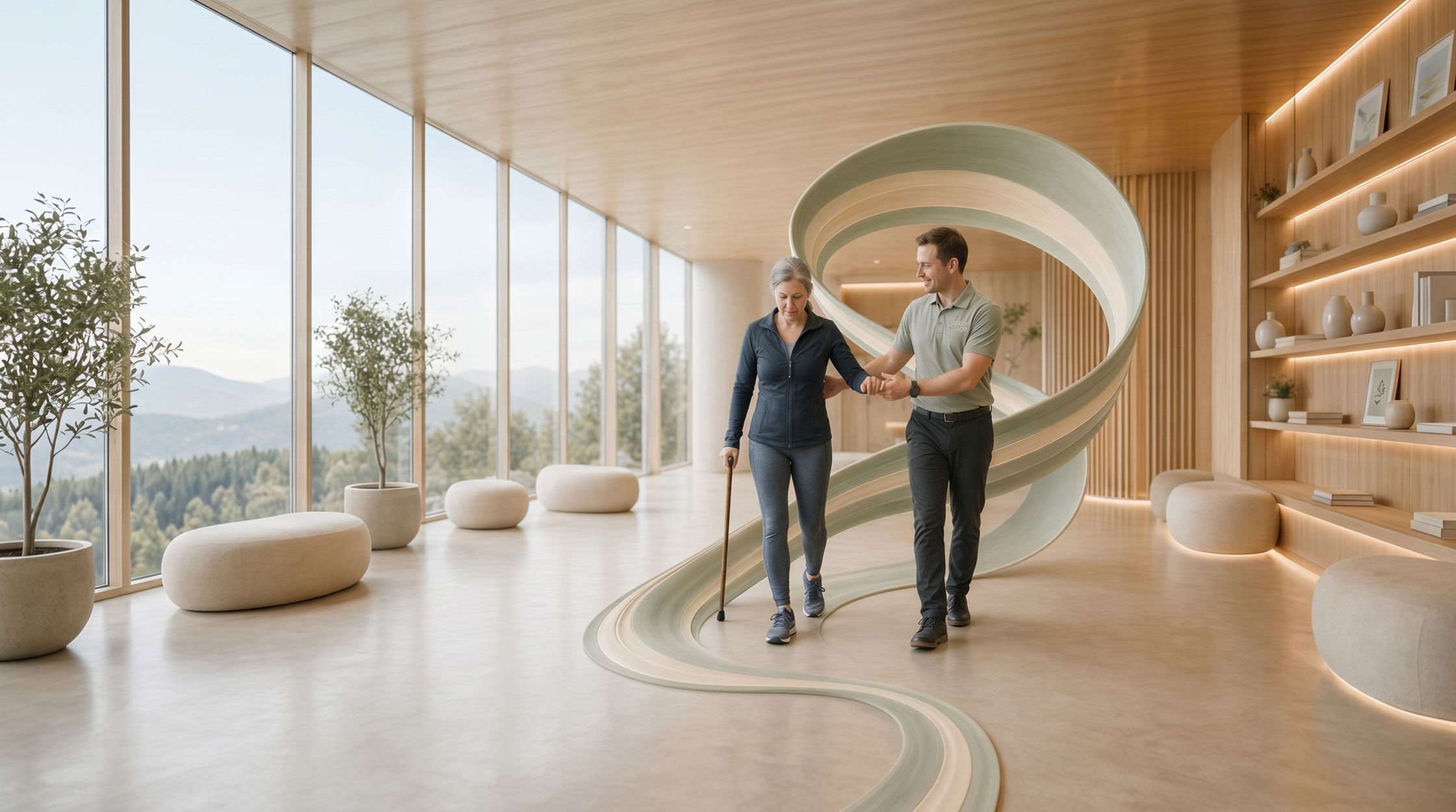
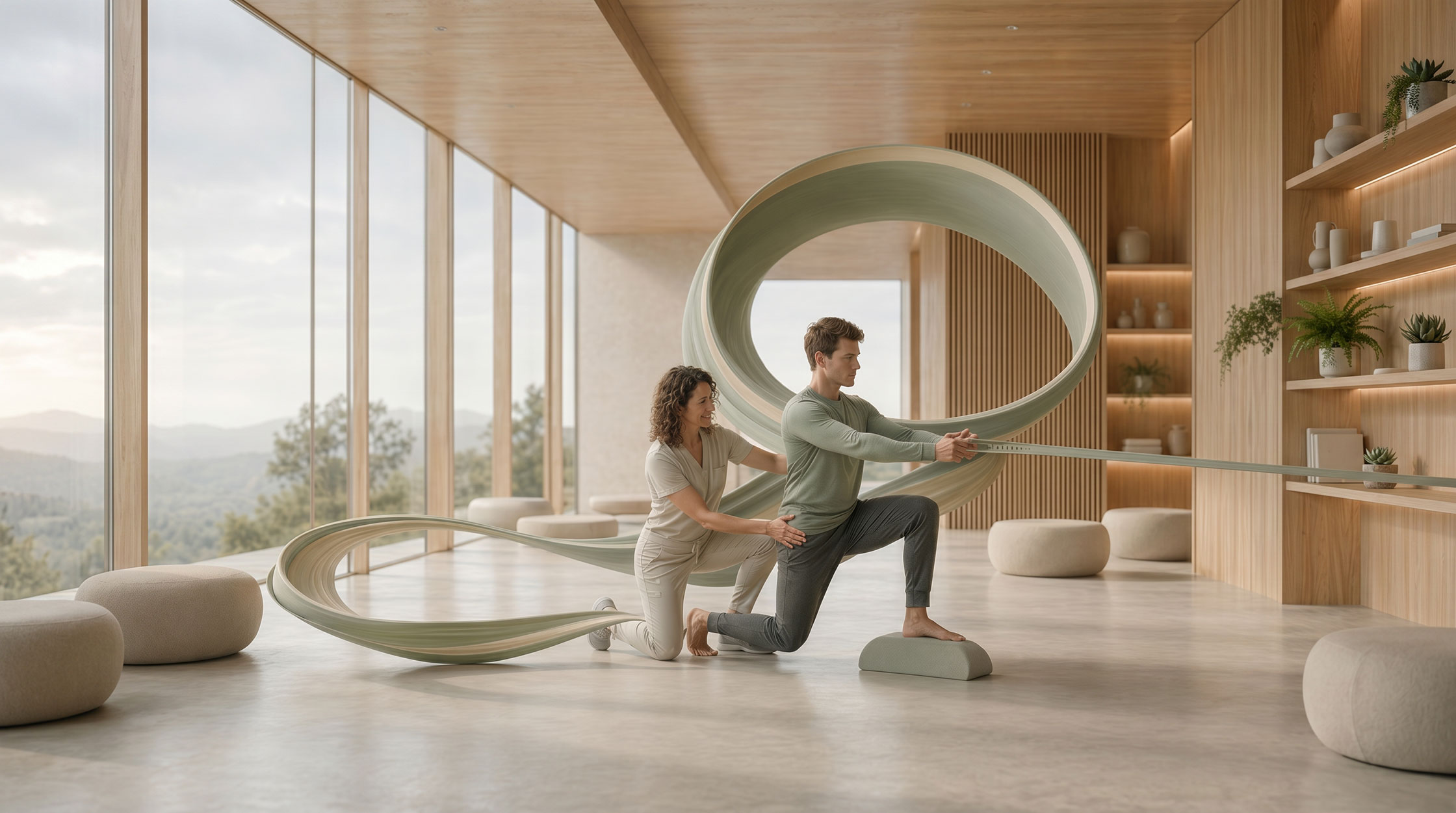
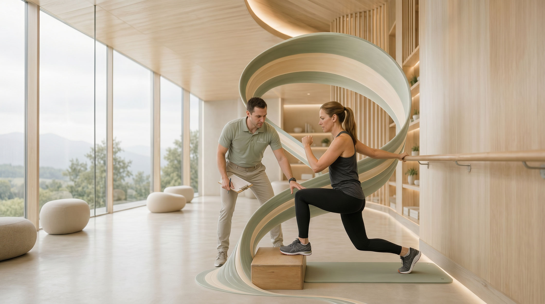
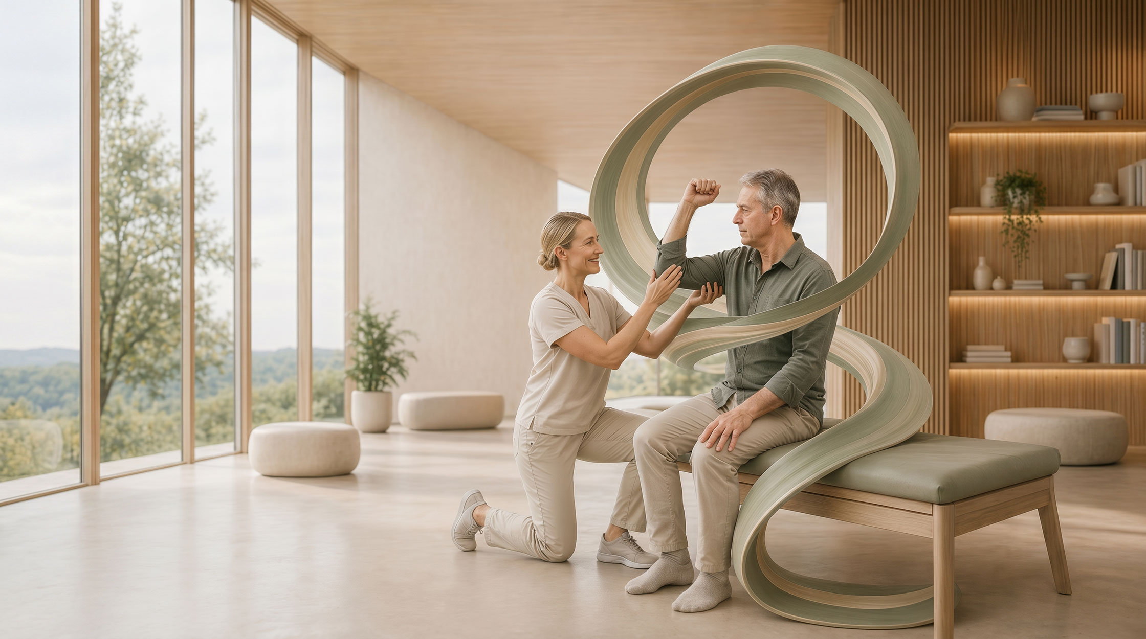
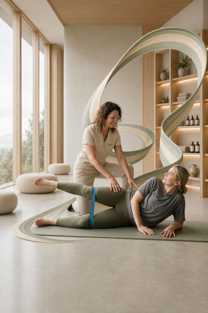
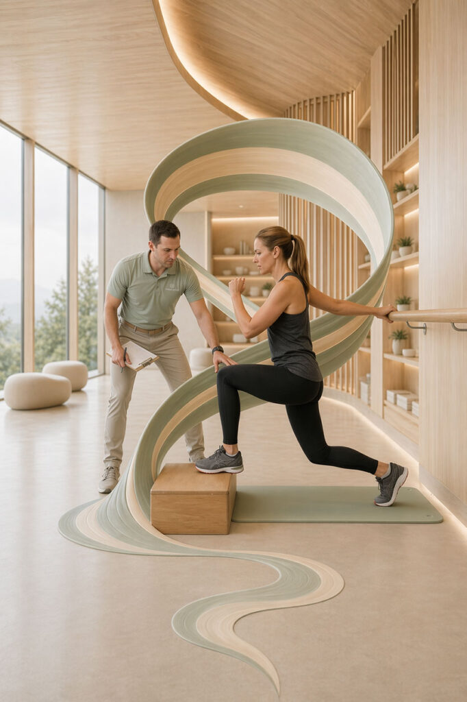
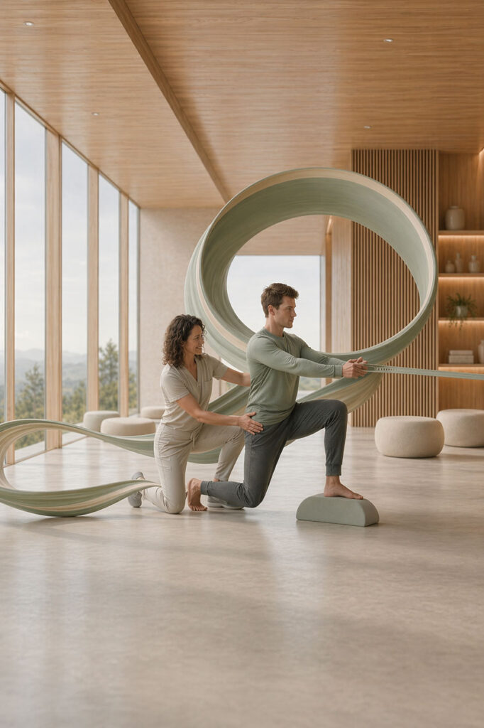
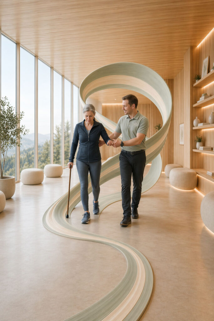
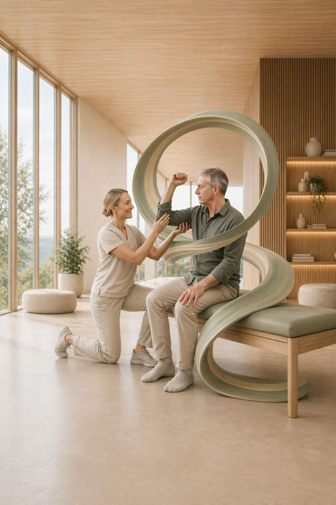
The creative vision for Moss & Motion was to imagine physical therapy as a premium wellness experience rooted in movement, care, and restoration. Rather than relying on stock-style medical visuals or cold corporate aesthetics, the brand imagery was designed to feel open, light-filled, and restorative — blending clinical professionalism with the softness and sophistication of a high-end wellness space. The result is a visual identity that frames rehabilitation not as a limitation, but as a return to strength, confidence, and ease.
The Creative Process: From Concept to Completion
The process began with positioning: defining how a physical therapy brand could feel both medically credible and emotionally inviting. The focus was on building a visual language that would resonate with clients seeking expert care while also reducing the intimidation often associated with treatment environments. That meant emphasizing calm interiors, guided movement, natural light, and subtle cues of human support rather than pain, pressure, or overly technical medical imagery.
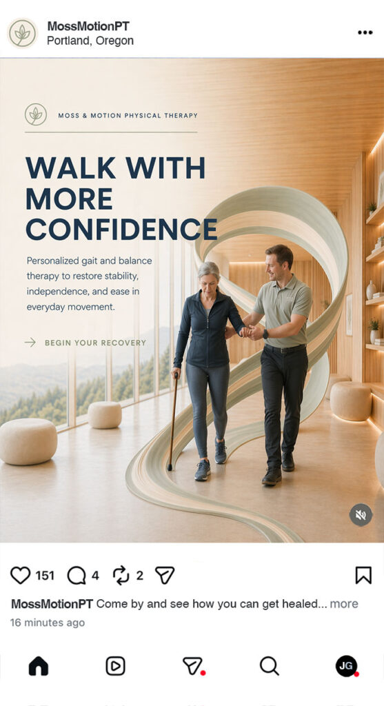
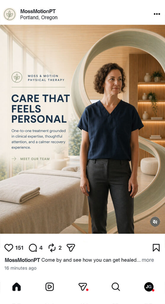
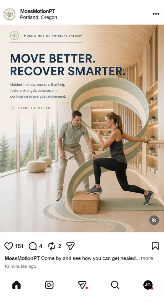
From there, the art direction centered on world building. Every scene was designed to express the brand’s core values through atmosphere as much as subject matter — spacious environments, gentle movement, organic forms, and a palette that feels fresh, clean, and grounded. The flowing visual motifs were developed to symbolize motion, progress, and continuity, helping unify the imagery into a brand world that feels recognizable and emotionally coherent across every touchpoint.
The website graphics were then shaped to function as both storytelling assets and conversion tools. Rather than simply decorating the page, the visuals were intended to create a first impression of professionalism, comfort, and premium care within seconds. This helps potential clients feel more at ease, understand the practice’s positioning immediately, and experience the brand as more established and intentional from the very first interaction.
Finally, the social and marketing creative was developed to extend that same identity into scroll-stopping campaign visuals. The goal was consistency: a brand presence that feels seamless whether encountered on a website, in an ad, or across social media. By treating physical therapy marketing with the same level of art direction typically reserved for luxury wellness or lifestyle brands, the project shows how strong creative can elevate perceived value, strengthen trust, and make a service-based business more memorable.