
Mosslight Cider Co.
Marketing Visuals & videos
CLIENT:
Mosslight Cider Co. (Spec)
SERVICE
Art Direction Brand Imagery (world building visuals)
Social media Ad Creatives
Mosslight Cider Co. was developed as a design-forward craft cider brand for a younger, visually literate audience that wants bold fruit flavor wrapped in a world that feels elevated, modern, and culturally current. The goal was to create a brand that could live naturally in Portland’s indie retail and nightlife scene while standing out on shelf through strong color, expressive packaging, and a more artful take on fruit-forward hard cider.
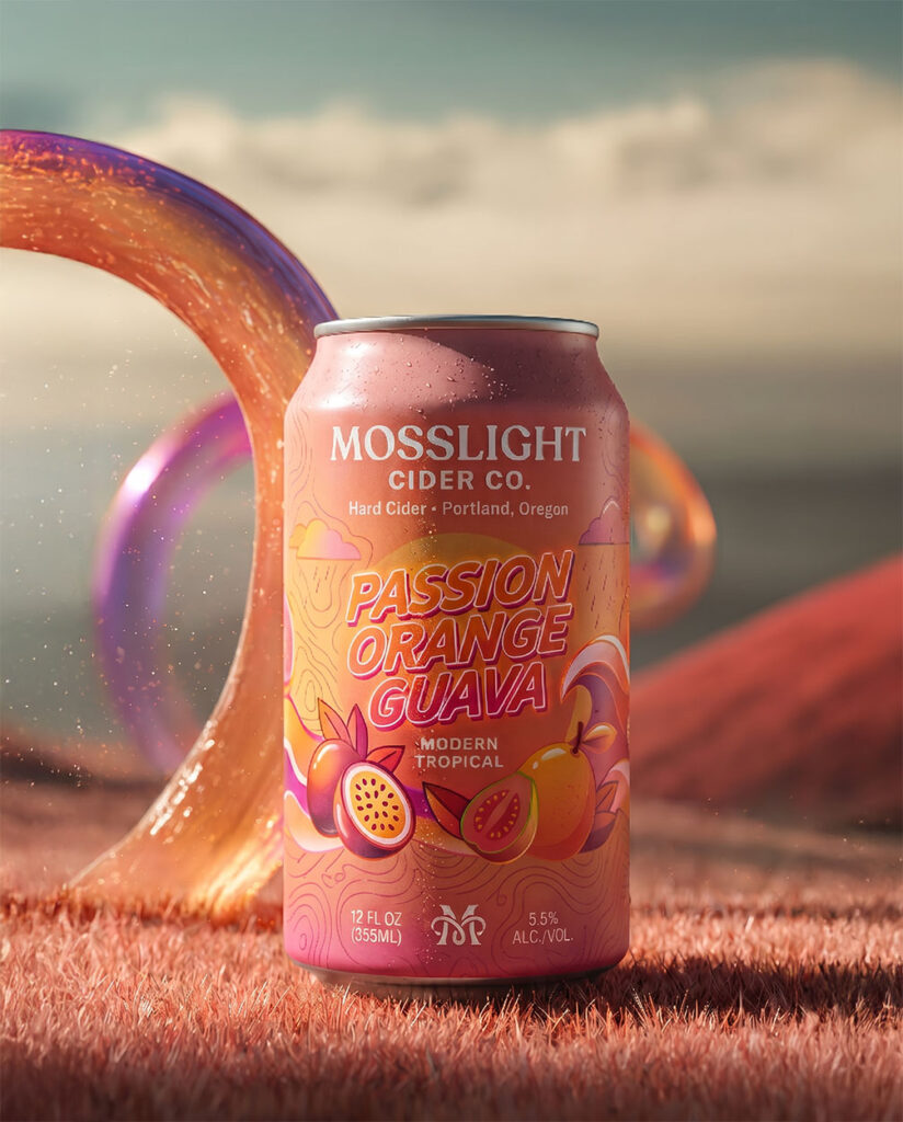
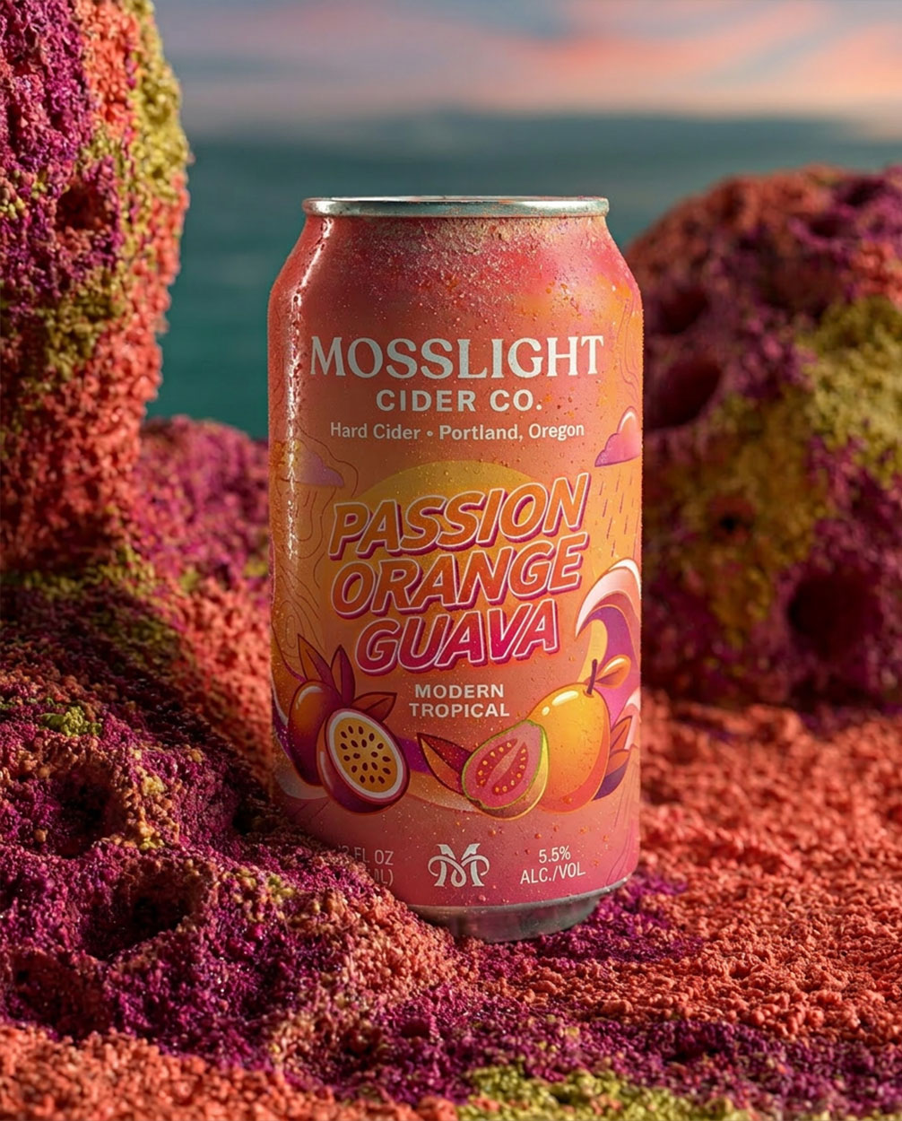
The visual system pairs crisp beverage minimalism with saturated, surreal flavor storytelling. Instead of leaning rustic or overly traditional, Mosslight was imagined as contemporary, collectible, and slightly cinematic—using gradient color, oversized fruit-inspired graphics, atmospheric environments, and sleek typography to turn each can into both a product and a mood. The result is a brand presence that feels premium but playful, grounded in Pacific Northwest sensibility while energized by tropical brightness.
Mosslight wanted a set of social media visuals and videos that could do more than showcase the cans—they needed to introduce the brand as a full visual experience. The deliverables were meant to support launch content, highlight each flavor in a bold and distinctive way, and translate the brand’s premium, fruit-forward, Portland-rooted identity into scroll-stopping campaign imagery and motion content that felt modern, shareable, and instantly recognizable.


Project Case Study
The Creative Vision:
The creative vision for Mosslight was to build a brand world that feels as vivid as the flavor itself: part orchard freshness, part neon escape, part Portland cool. The imagery extends the packaging into immersive scenes where condensation, glowing curves, dreamlike skies, and lush color fields make the cider feel refreshing, transportive, and unmistakably design-led. Every decision—from the warm sunset palette of Passion Orange Guava to the polished, editorial-style composition—was made to express fruit intensity with sophistication rather than novelty.
The Creative Process: From Concept to Completion
The process began by defining what would make Mosslight Cider Co. feel distinct in a crowded craft beverage space. At the center of the brand was a clear creative tension: Pacific Northwest character meets neon fruit energy. That idea shaped every decision moving forward, helping position Mosslight as a Portland-rooted cider brand that feels contemporary, expressive, and premium rather than rustic or overly traditional. From the outset, the goal was to create an identity that could communicate craft quality, bold fruit flavor, and a strong sense of place all at once.
With that foundation in place, the next step was building a packaging system that felt both cohesive and collectible. Each flavor needed its own emotional color world while still belonging to the same visual family, so the process focused on balancing consistency with distinction. Bold fruit-inspired graphics, strong color blocking, clean typography, and subtle Pacific Northwest references worked together to give the lineup a modern shelf presence with immediate flavor recognition. The result was a system designed not only to stand out in-store, but to feel scalable across future SKUs, merch, mixed packs, and seasonal extensions.
From there, the brand moved beyond packaging into a fuller visual world. The creative direction for Mosslight’s imagery was developed to make the product feel immersive, atmospheric, and socially shareable—less like a standard beverage mockup and more like a complete mood. Saturated landscapes, glowing curves, tactile textures, condensation, and cinematic lighting were used to extend the flavor story beyond the can itself. These world-building visuals helped translate the identity into launch-ready social media content and motion-friendly campaign assets, giving Mosslight a presence that felt polished, transportive, and instantly recognizable in digital spaces.
Throughout the process, the focus was on creating a brand that felt believable enough for retail, but elevated enough to feel aspirational. Every element—from the flavor palettes and typography to the hero visuals and social ad creatives—was designed to support the same impression: vivid flavor with creative identity. By completion, Mosslight had evolved into more than a packaging concept; it became a fully articulated brand experience built for the shelf, for the feed, and for the kind of audience that connects with products through design, mood, and visual storytelling.